Apple Health: Infrastructure by Design
Apple Health reads as an overstuffed, mediocre free app. It is neither mediocre nor really free: it is infrastructure built on purpose, and the purpose is not health but hardware retention.
- Author
- Bear Liu, Fractional Product Designer
- For
- founders and design leaders deciding whether to build a product people open every day, or infrastructure people trust without thinking about it
- Method
- two recorded naked-eye walkthroughs (61 and 56 minutes), cross-referenced against Google Health, Fitbit, Apple's own statements, public market data, and the wider design community's critique
Why I tore down the app everyone already has and no one rates
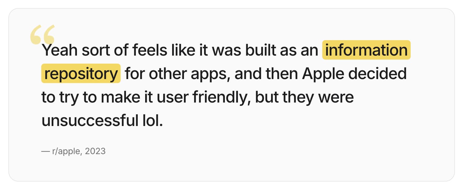
Most teardowns in this series start with a product people choose. Apple Health is the opposite. It arrives pre-installed on every iPhone, almost nobody chooses it, and the design community's verdict is close to unanimous: overwhelming, cluttered, hard to navigate. A 2026 thread on r/UXDesign is titled, with no irony, "Apple Health: Bad UX or Irresponsible UX?" A widely upvoted r/apple comment from 2023 puts the intuition more precisely than most design essays manage:
"Yeah sort of feels like it was built as an information repository for other apps, and then Apple decided to try to make it user friendly, but they were unsuccessful lol."
That comment is the whole teardown in one line, except for one word. It is not that Apple tried to make a repository user-friendly and failed. It is that Apple built a repository on purpose and declined to dress it up as a product. The "failure" the reviewer feels is a choice the reviewer cannot see, because the choice is invisible from inside the app. You can only see it from the business behind the app.
This report carries two reads that lock together. The first is a diagnostic lens: Apple Health was designed as infrastructure, not a product, and those two things are graded on opposite scorecards. The second is the commercial engine underneath that choice: the app is a free utility whose real job is to lock you into the hardware. The lens explains what Apple built. The engine explains why Apple would never build it any other way. Hold both and the most criticised health app on earth turns out to be built almost exactly right, for a goal that has very little to do with the goal reviewers assume.
What follows is six lenses. Each began as something I watched happen on screen. Each became a question I now carry into client work. The value is not the verdict on Apple. It is whether these questions find anything when you point them at your own product.
Lens 1: The product that refuses to be a product
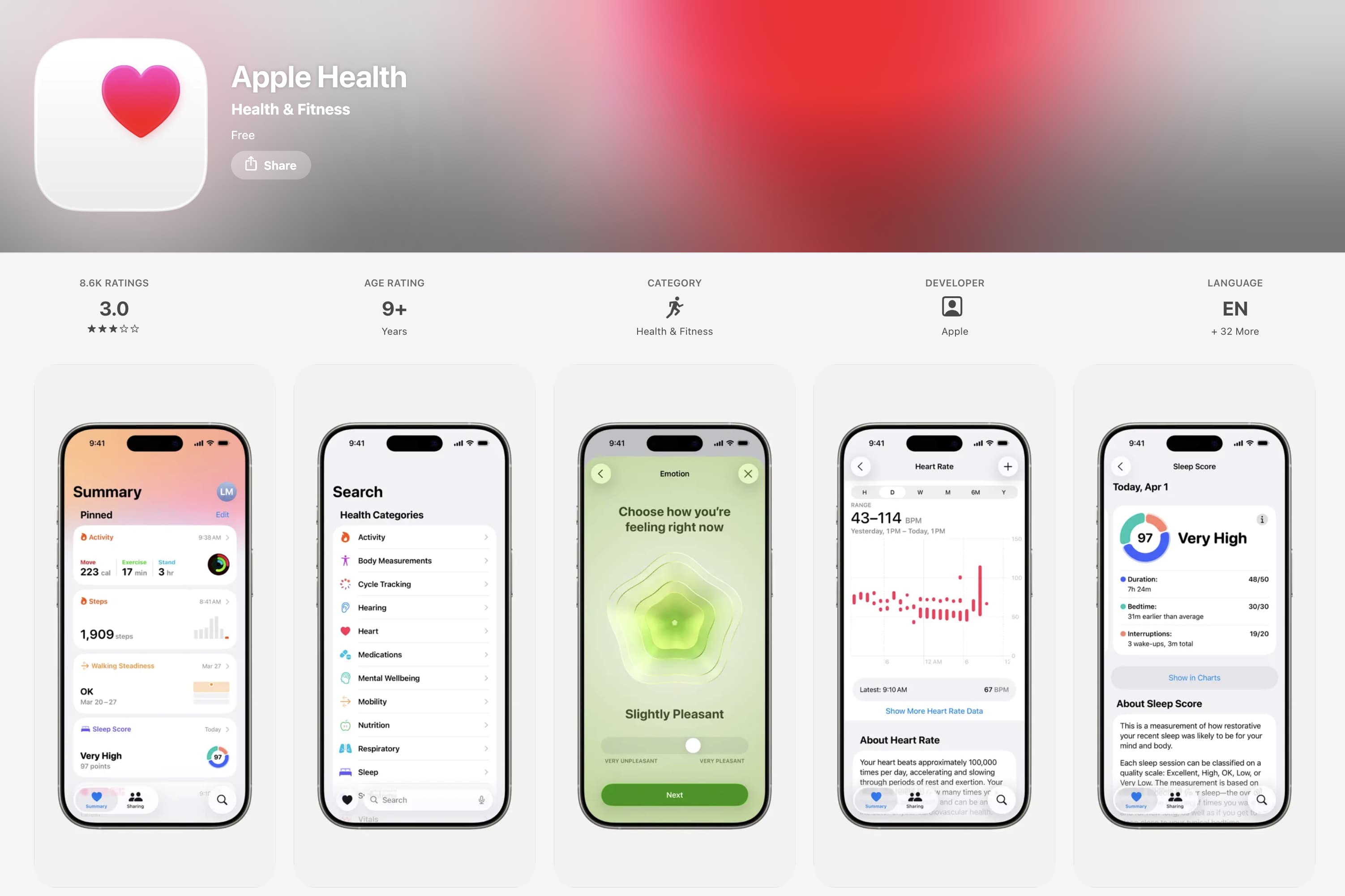
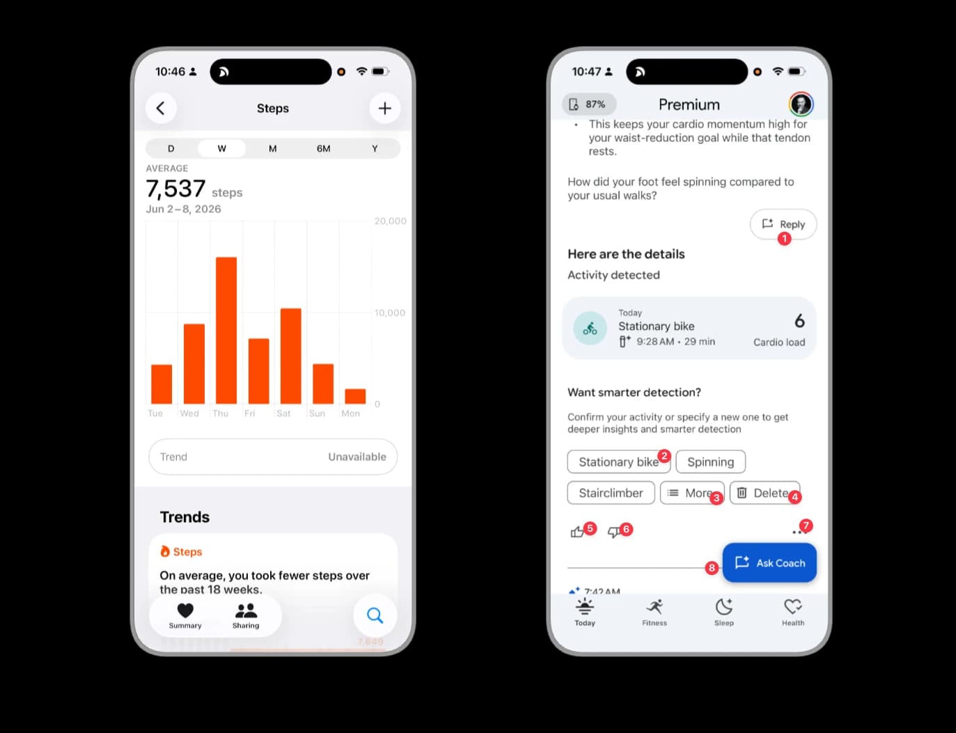
Open Apple Health and you land on a single tab called Summary. Everything lives here in one vertically scrolling page: pinned metrics at the top, then Trends, then Highlights, then prompts, then a long tail of educational articles that does not surface until you are roughly 80 per cent of the way down the page. There are no top-level tabs splitting fitness from sleep from heart. Tap Browse and you find fourteen categories stacked in a list: Activity, Body Measurements, Cycle Tracking, Hearing, Heart, Medications, Mental Wellbeing, Mobility, Nutrition, Respiratory, Sleep, Symptoms, Vitals, Other Data.
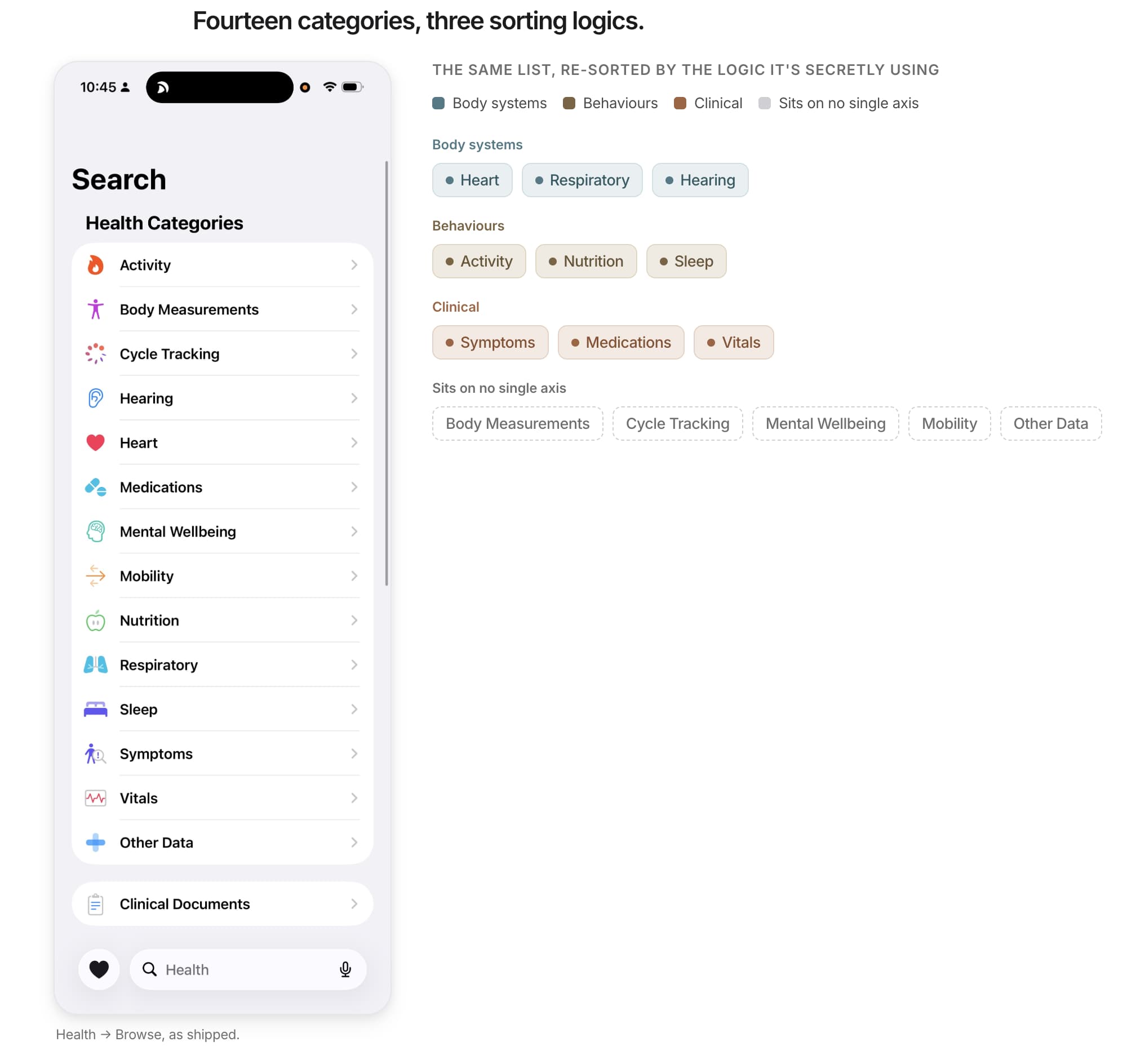
Sit with that list for a second, because it is the source of the "overwhelming" complaint, and the real reason is not the count. Fourteen is not a lot. The reason is that the fourteen categories are sorted by three different logics at once. Some are body systems (Heart, Respiratory, Hearing). Some are behaviours (Activity, Nutrition, Sleep). Some are clinical (Symptoms, Medications, Vitals). A user's mind tries to build one mental model and cannot, because there is no single axis to build it on. The cognitive overload that designers keep reporting is real, and it is diagnosable: it is taxonomy incoherence, not volume.
Now here is the move that matters. A normal product would fix this by splitting the data into purpose-built tabs, the way Google Health does, the way the pre-2019 Health app did. Apple went the other way and collapsed everything into one page. Read as a product decision, that looks like a mistake, and the design community grades it as one. Read as an infrastructure decision, it is correct. Infrastructure does not curate. A water main does not decide which tap matters most to you. It holds everything, stays neutral, and lets you decide what to pull. Apple Health holds 150-plus data types in one neutral container and pushes the curation work onto the user through pinning and reordering.
This is the lens I want to name and hand you: the Infrastructure-versus-Product Audit. A product is graded on engagement, retention, daily actives. Infrastructure is graded on trust, stability, and low interruption. You do not open infrastructure every day. You open it when something is wrong, and the rest of the time you simply trust it is there and intact. The two scorecards pull in opposite directions. A product wants you back tomorrow. Infrastructure wants you to forget about it. Apple Health is built to the second scorecard and reviewed against the first, which is why the reviews are bad and the product, on its own terms, is not.
The audit has a cost line, and Apple pays it. Optimising for the existing, already-converted user (the person who has set up pins and knows where to look) means the first-time user gets a wall of mixed-axis categories and bounces. One designer wrote that she found the app "overwhelmingly difficult to navigate" and went and downloaded Nike Run Club instead. That is an activation failure, and Apple accepts it, because its target is not the new user. Its target is the person who already bought the Watch. Infrastructure serves the converted. Which raises the obvious question, the one Lens 3 and Lens 4 exist to answer: converted to what?
Lens 2: The ontology was never a dashboard
If you want proof that Apple Health is infrastructure rather than a dashboard, you do not need the marketing. You can read it off the data model.
I drew the product's ontology during the teardown. Strip it to the load-bearing parts and it looks like this. A Source (Apple Watch, an iPhone sensor, a third-party app, a manual entry, a clinical provider) writes a Sample (one measurement). Each Sample is typed by a Data Type (steps, heart rate, VO2 max). Every Sample, from every Source, flows into one place: the HealthKit Store, a local, encrypted, on-device repository. From there the store feeds everything downstream: the Summary view, Trends, Sharing, Health Records.
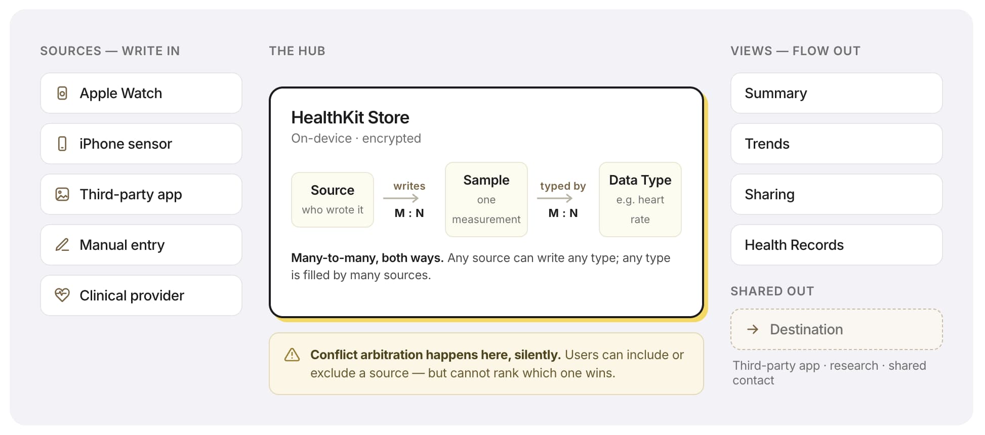
The key relationship is that Source and Data Type are decoupled, many-to-many, with HealthKit as the central hub. Any source can write any type. Any type can be filled by many sources. Your weight can come from a Withings scale, your Apple Watch, and a manual entry, all at once, all merged into one timeline. Structurally this is the same shape as Cursor's "everything flows into Context, all features flow out of Context". Sources flow in, the hub aggregates, the views flow out.
That single relationship is both the leverage and the wound. It is the leverage because it is exactly what makes Apple Health a credible neutral aggregator. It does not produce data. It collects, types, and presents it, which is precisely the posture that earns the right to hold a Mayo Clinic record next to a step count. And it is the wound because a model optimised for neutral aggregation cannot also be a curated picture. When you force a many-source, 150-type repository to render itself as one linear scroll, you get exactly what users describe: data that "drifts" as it re-sorts, a Summary that feels like a data dump rather than a story. The leverage point and the pain point are the same line in the ontology.
The cleanest way to see this is the control group. Fitbit and Whoop have effectively one source: their own hardware. Their ontology has no many-to-many decoupling, so their home screen can be a stable, curated dashboard, because there is only ever one author of the data. Apple Health's Summary wobbles and theirs does not, and the difference is not UI craft. It is ontology. Apple chose to be the neutral container for everyone's data, and the price of that neutrality is paid on the home screen, every day, by every user with more than one source.
The transferable move here is the central-hub read. When you study a data product, find the one entity everything flows into and out of. Then ask what that hub is optimised for. If it is optimised for neutral aggregation, stop expecting a curated front door, and stop blaming the designers when the front door feels busy. The busyness is the hub keeping its promise.
Lens 3: Zero input is a business decision wearing a design costume
Here is the observation that turns the teardown from a UX read into a strategy read.
During the walkthrough I estimated that 80 to 90 per cent of the data in Apple Health arrives automatically, captured by the Watch and third-party devices and written in the background. Manual entry exists (tap the plus on any data type and you can add a heart rate reading by hand) but it is plainly not the primary path. The product is built to be filled passively. It asks you for almost nothing.
Then I opened Google Health and the contrast was total. Within seconds the AI coach surfaced a message about my deep sleep, then asked me to choose between three options about why I woke at 4am, then offered a free-text reply. Scrolling further, every recovery card carried a thumbs-up and thumbs-down and a three-dot menu with "useful / not useful / dismiss". Google Health instruments everything. It treats every screen as a chance to collect another signal from you.
Two health apps, two opposite postures, and the explanation is not taste. It is the business model showing through the interface. Google is a data company. Your behaviour is its product, so its design extracts behaviour at every turn. Apple is a hardware company. Your behaviour is not its product, so it has no reason to extract it, and every reason not to, because the thing it is actually protecting is your willingness to trust it with the most sensitive data you own. A privacy lawyer at the Electronic Privacy Information Center put the public framing plainly: Apple's on-device storage is "more privacy protective than if it immediately is shared with other companies". Apple does not ask, because not asking is the product. Restraint is the feature.
This is a lens I will use on every product from now on, and I would hand it to any founder. I call it the Revenue Tell: read the design decision back to the business model. When you see a product that is conspicuously restrained (no telemetry, no upsell, no nagging) or conspicuously extractive (constant prompts, ratings, questions), do not file it under UX preference. Ask what the company sells. The interface is almost always downstream of the revenue model. Apple's calm and Google's chattiness are not two design philosophies. They are two answers to the question "whose product is this data?"
So if Apple's product is not the data, and not the app, what is it? Lens 4.
Lens 4: The free app is a retention engine
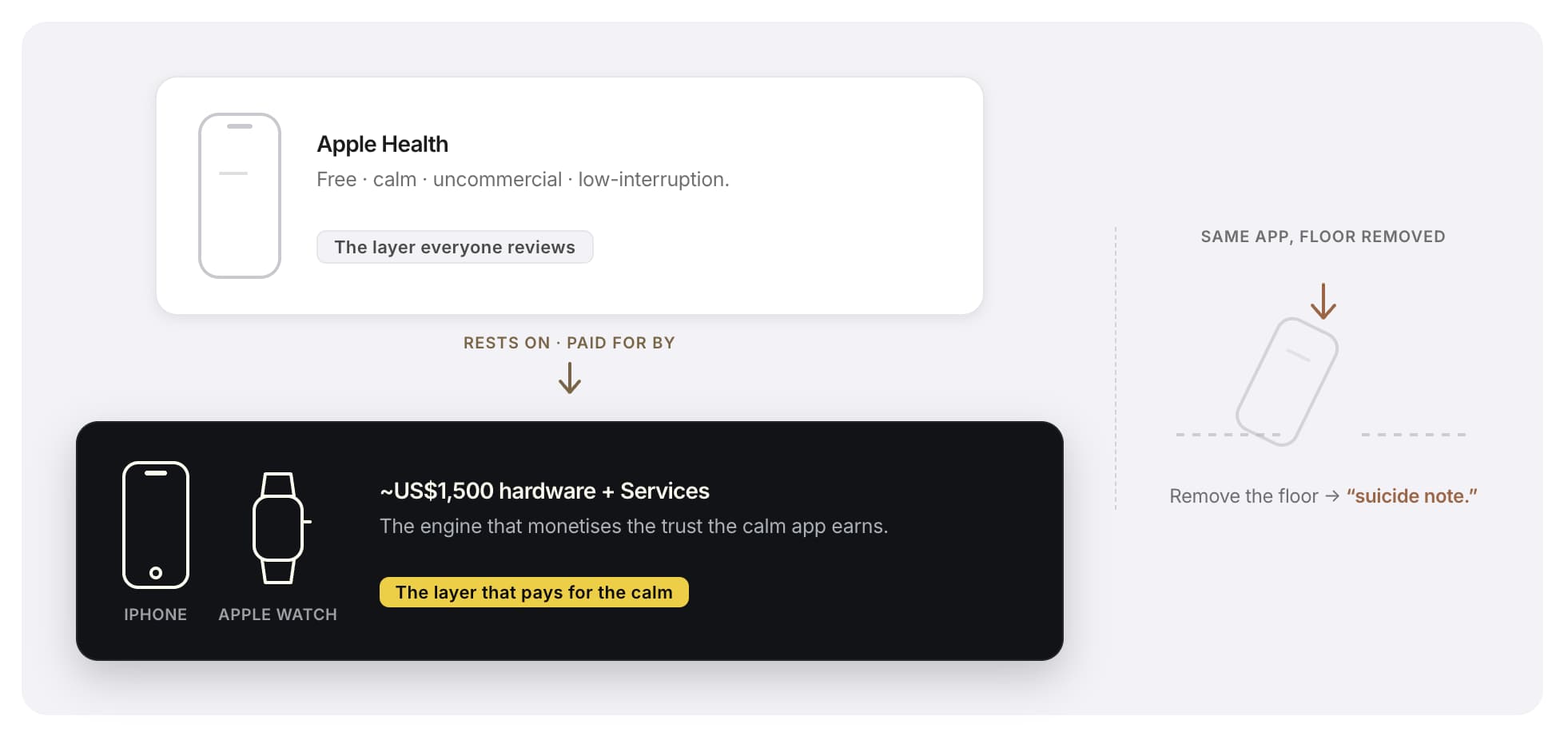
Apple Health is free and will never be charged for. Most reads stop there and call it a goodwill feature. That is the read to refuse. A company does not pour FDA-grade clinical engineering into a feature for goodwill. It does it because the return shows up somewhere else on the balance sheet: hardware.
Walk the logic. Apple Watch shipments fell 19 per cent year on year in 2024, the second consecutive annual decline, and the Watch slipped to second place in global smartwatch share. In a maturing category with lengthening upgrade cycles, the question that keeps Apple's hardware analysts up at night is what makes someone buy the next Watch. The consistent answer from the outside is health. A CFRA analyst told Fortune that "greater penetration on the healthcare side of things is a massive opportunity for them, and something they seriously want to get more penetrated into," and the same coverage framed health features as a way to "reactivate" an upgrade cycle that hardware refreshes alone no longer drive. Tim Cook used hearing health and sleep apnoea detection as the headline of the Q4 2024 results. Health is not a side feature of the Watch. It is increasingly the reason to buy the Watch.
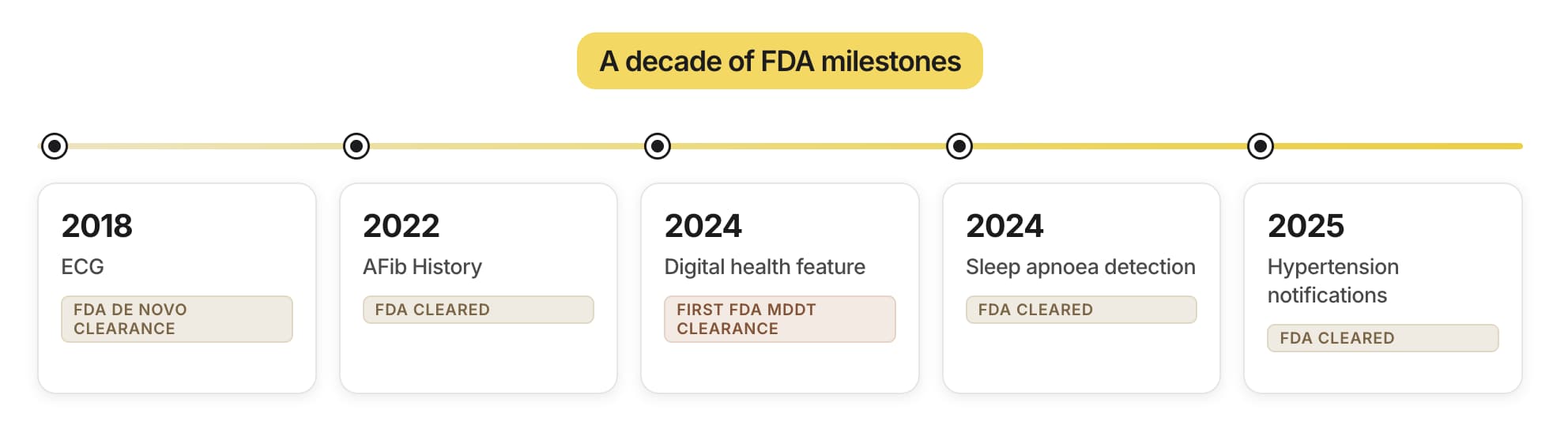
Apple Health is where that reason compounds. Two mechanisms do the work. The first is switching cost. The longer you use it, the more it holds: years of trends, a Medical ID, connected third-party devices, family members sharing data with you. There is no clean cross-ecosystem export standard for this, so a deeply-used Apple Health is something close to non-portable. Moving to Android does not mean buying a new phone. It means abandoning your health history. The second mechanism is the trust moat, and Apple has been building it deliberately for years through regulatory clearance: ECG by FDA de novo in 2018, AFib History in 2022 and the first FDA MDDT clearance for a digital health feature in 2024, sleep apnoea detection in 2024, hypertension notifications in 2025. Each clearance is a brick in a wall that says "you can trust this container with medical-grade data", and each brick is one a competitor cannot easily lay, because it took Apple a decade and a research apparatus (the Apple Heart Study with Stanford, ResearchKit with three million-plus participants) to lay them.
Now the two reads snap together. The "infrastructure" posture from Lens 1 is not a separate fact from the "retention engine" truth here. It is the form the retention engine has to take. To be the container people trust with their health for a decade, you have to behave like infrastructure: stable, neutral, low-interruption, uncommercial, private. The moment Apple Health started behaving like a product (charging, nagging, instrumenting, upselling) it would forfeit the trust that makes it sticky, and the stickiness is the entire point. Apple chose infrastructure because infrastructure is what a retention engine has to look like to work. The restraint that costs Apple Health its review scores is the same restraint that earns it its lock-in.
That is the diagnostic lens and the commercial engine as one sentence: Apple Health is infrastructure by design because infrastructure is the only shape a trustworthy retention engine can take.
Lens 5: The crack in "trustable"
A thesis is only worth as much as the evidence that could break it, so I went hunting for the place this one strains, and what I found on screen was sharper than the crack I went looking for.
I opened Data Sources & Access for heart rate. The same metric was being written by a long stack of sources: several Apple Watches, Nike Run Club, a Withings device, a handful of fitness apps. My first read was that this was a black box. Then I tapped Edit, and the picture changed. Every software source becomes a toggle: untick the app and it drops to "Inactive" and stops feeding the timeline. I switched Withings off and its flow stopped, switched it back on and it returned. So the strong version of the complaint, that Apple gives you no handle on data hygiene, is simply wrong. If a badly calibrated third-party app is polluting a metric, you can evict it in two taps.
The control has two real limits, though, and that is where the honest tension lives. The first: hardware sources cannot be touched. The Apple Watches at the top of the list do not respond to Edit, and there are several stale duplicates among them I cannot clear, so you can neither disable a watch nor remove one that no longer exists. The second, and the more telling: the control is binary, not ranked. You can set each source to on or off, but when two active sources write the same heart-rate reading a second apart, you cannot tell Apple which one wins. There is no priority order to drag, no "trust this device over that one". Apple still does that merge itself, silently. You control who is in the room, not who gets the final word when two voices in the room disagree.
Hold that against the thesis. The whole argument is that Apple trades function for trust, and trust in a data system is supposed to come from data hygiene, from knowing the numbers are clean and you control what feeds them. On the coarse version of that, inclusion, Apple delivers: you decide which sources feed the store. On the fine version, arbitration, it does not, and it keeps the constraint candid. HealthKit is a local data store, and as one technical analysis of the platform puts it, "this design protects privacy but creates serious limitations". Apple has bet that for a billion non-technical users a clean on/off switch plus a silent merge is more trustworthy than a priority panel they would have to reason about. That is a defensible bet. It is also the narrow seam a competitor or a regulator could still pick at: on the question of which source wins a conflict, you are not in control, and you cannot see the rule that decides it.
The same opacity logic explains the other widely-cited complaint: the high-value secondary scenarios are buried. Health Sharing, the feature that turns a personal dashboard into a family health network, sits behind a multi-step flow with enough preconditions that the Apple support forums are full of stuck "invite pending" threads. Clinical Documents and Health Records, arguably the hardest-to-replicate asset Apple has (500-plus US institutions, 11,000-plus locations, now expanding into the UK and Canada), are buried so deep that a long-running Reddit question is simply "why so few institutions?", when the real answer is that most users never find the feature at all. Infrastructure hides its advanced controls by design, the way a building hides its electrical panel. The cost is that Apple's most differentiating capabilities are the ones users are least likely to discover, and the gap between the "empower" marketing and the lived experience is exactly that buried value.
So the thesis survives, in a more precise form than I first reached for. Apple Health trades function for trust, and it earns that trust at mass-market scale by giving users coarse control, which sources are in, while keeping the fine control, which source wins, inside a silent merge. That arbitration layer, not source removal, is the load-bearing assumption with a hairline in it. If the regulatory or competitive weather changes, the place it strains first is conflict resolution between trusted sources.
Lens 6: When to copy this, and when copying it kills you
The reason this teardown matters beyond Apple is that "be restrained, be calm, hold everything in one neutral place, do not nag" is currently fashionable design advice, and it is advice that will quietly kill most products that take it.
Apple Health's restraint works for one reason that has nothing to do with the app: there is a fifteen-hundred-dollar hardware ecosystem underneath it monetising the trust. The free, uncommercial, low-interruption posture is affordable only because the money is being made one layer down, on the Watch and the iPhone and the Services attach. Strip that ecosystem floor away and the same design is a suicide note. A standalone health startup that refuses to charge, refuses to nag, refuses to instrument, and buries its best features behind a wall of neutral categories has no retention engine underneath to justify the restraint. It just has low engagement and no revenue.
So the rule the teardown produces is conditional, and the condition is the whole rule. Infrastructure-grade restraint is a strategy you can only afford on top of a monetisation layer that the restraint is protecting. Apple can be calm because the Watch is loud. Before you copy Apple's serenity, find your Watch. If you do not have one, you cannot afford the serenity.
For the specific case I am closest to, multi-source health and fitness products, the teardown leaves two concrete instruments. The first is the source-conflict decision. The moment your product aggregates data from more than one device, you face Apple's choice: hand the user transparent control over which source wins, or take the merge into a silent black box. Apple chose the black box and bought scale with it, at the cost of a crack in its trust story. A smaller product without Apple's brand-trust reserves probably cannot afford that crack and should lean transparent. The second is the dashboard-versus-coach fork. Apple built a repository that reviews badly and retains a hardware base. Google built a coach that engages hard and harvests data. Those are not two points on a quality scale. They are two different businesses, and the design of each is correct for the business it serves. Pick your business before you pick your interface, because the interface is the business made visible.
What this means if you are the one shipping
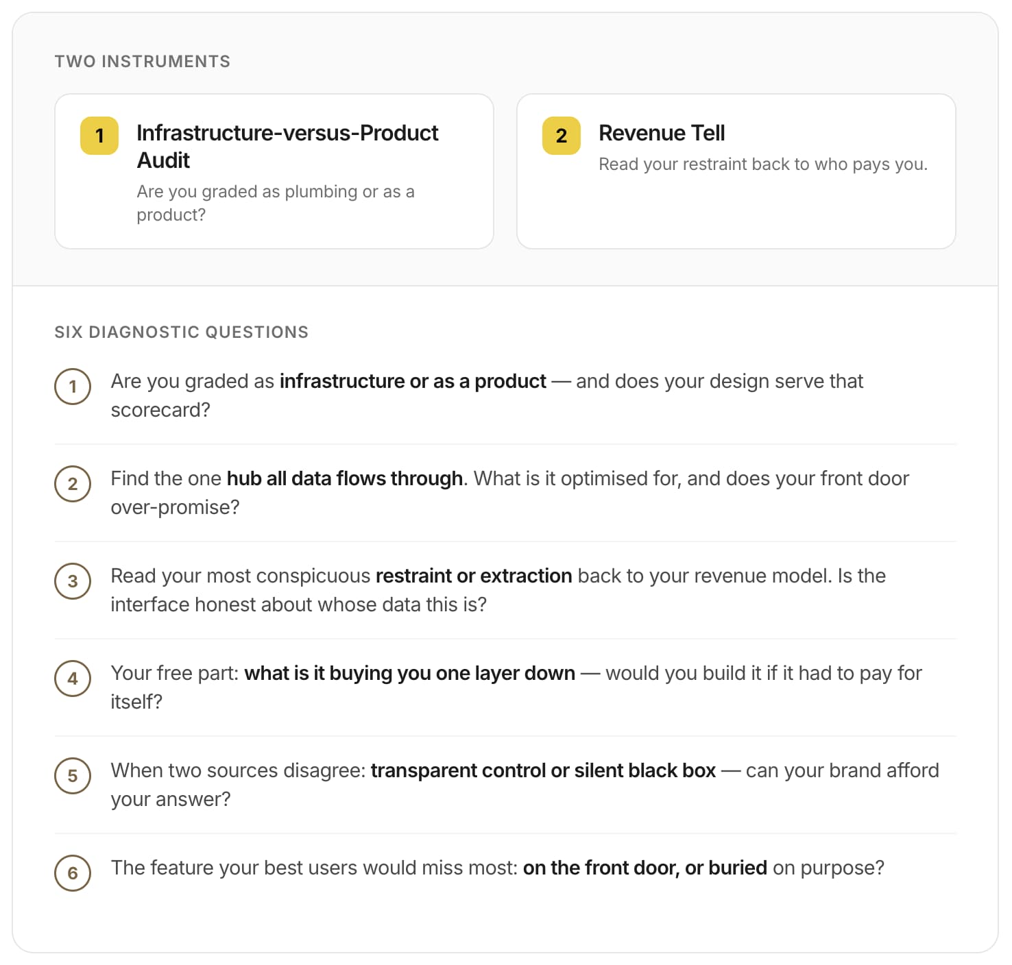
Strip Apple away and six questions remain that do not care which product you run.
- Is your product graded as infrastructure (trust, stability, low interruption) or as a product (engagement, retention, daily actives), and does your design actually serve the scorecard you are graded on, or the other one?
- Find the one entity all your data flows into and out of. What is that hub optimised for, and does your front door make a promise the hub cannot keep?
- Look at your most conspicuous design restraint, or your most conspicuous extraction. Read it back to your revenue model. Is the interface telling the truth about whose product the data is?
- The free part of your product: what is it really buying you one layer down, and would you still build it if it had to pay for itself directly?
- Where two sources of the same data disagree, do you give the user transparent control or a silent black box, and can your brand afford the answer you chose?
- The feature your best users would miss most: is it on the front door, or buried where infrastructure hides its controls, and is that on purpose?
The deepest thing Apple Health taught me is that the same design decision can be a product's worst review and its best strategy at the same time. The single neutral Summary that designers call a data dump is the exact posture a decade-long retention engine has to adopt to be trusted. Apple is not failing to make a good health product. It is succeeding at making infrastructure that keeps you buying the hardware, and choosing, correctly, to take the bad reviews as the price.
If any of those six questions landed without a clean answer, that gap is worth a closer look.
I write diagnoses like this one for other products: where your design is quietly serving the wrong scorecard, what that is costing you, and what to change first. If you would like one for yours, email me at hi@bearliu.com.