Arc: The Moving List
Arc didn't die from complexity. It died from inviting the wrong audience, asking them to learn too much, and running that bet on a business model with no room for retention to slip.
- Author
- Bear Liu, Fractional Product Designer
- For
- design leaders and founders weighing whether a product's troubles are cosmetic or structural
- Method
- two recorded naked-eye walkthroughs, cross-referenced against Dia (the successor), public data, and the founder's own farewell letter
Why I tore down a dead product
Most teardowns pick a product that is winning. I picked one that is over.
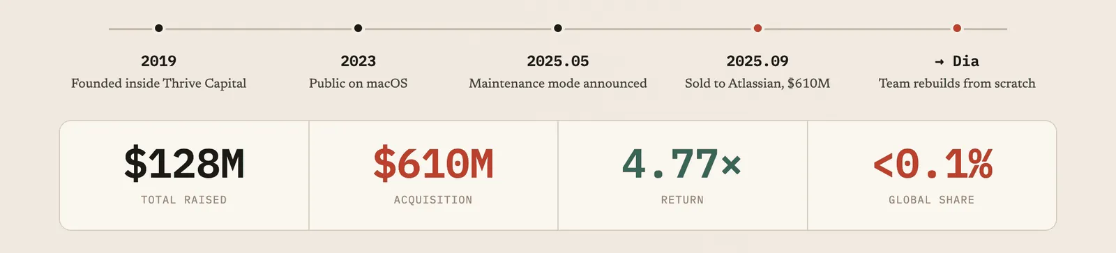
Arc is rare because you can read its entire lifecycle in a single sitting. Founded inside Thrive Capital in 2019. Public on macOS in 2023. Roughly $128M raised across seed to a $50M Series B. Maintenance mode announced in May 2025. Sold to Atlassian for $610M that September. The team walked away to build Dia. Global browser share never crossed 0.1 per cent.
A finished story is more useful than a live one. When a product is still fighting, you are guessing at cause and effect. When a product is dead (stopped at maintenance mode) and its own makers have rebuilt from scratch, the causes stop being theoretical. What they packed up and carried into the next product does the diagnosis for you.
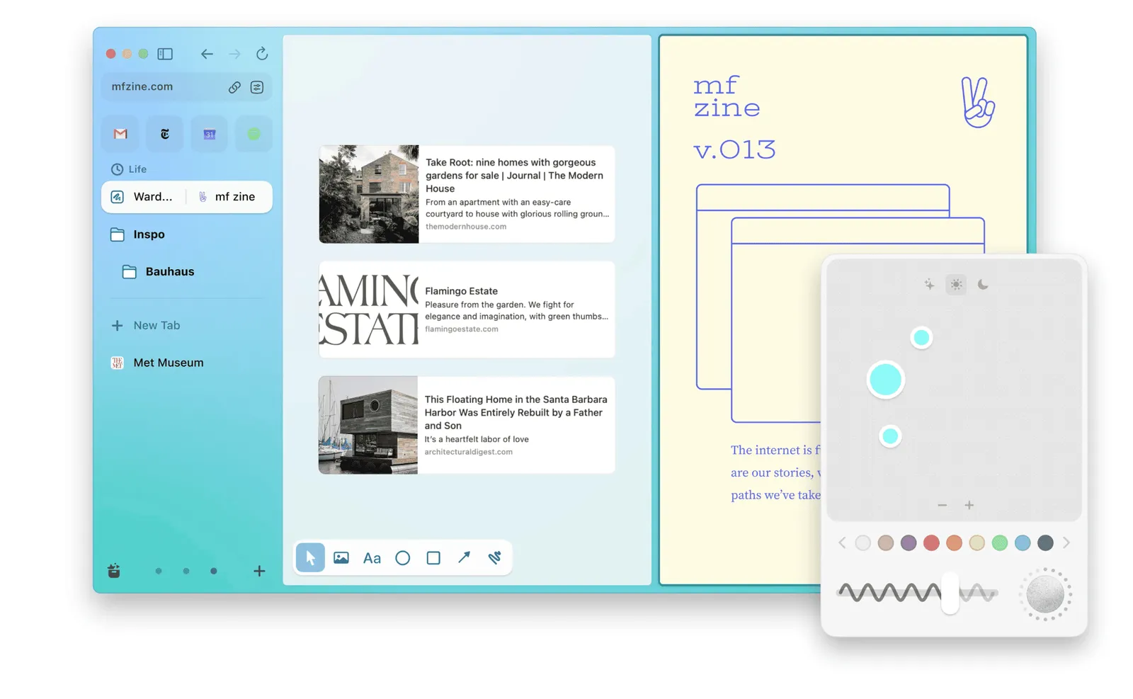
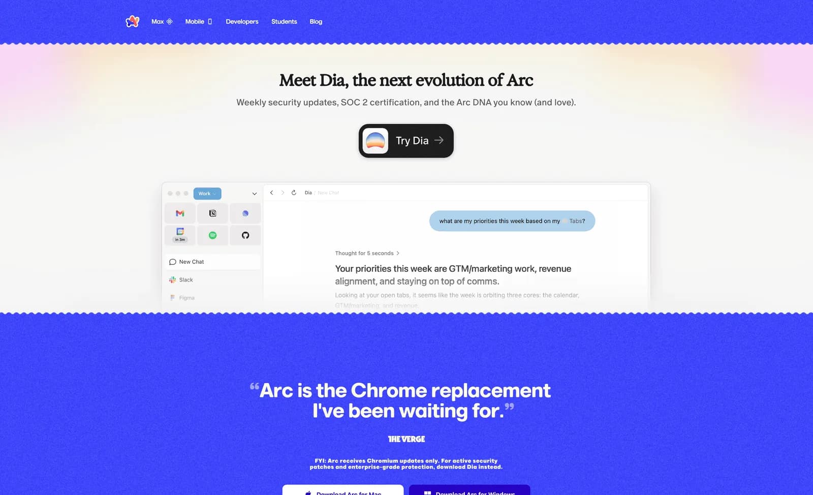
There is one detail I want to put first, because it sets the tone for everything else. Open arc.net today and the first thing the page does is point you somewhere else. "Introducing Dia, the next evolution of Arc." A product using its own homepage to send you to its replacement. I have never seen a cleaner admission that a company has moved on from something still running. That banner is not a footnote to this teardown. It is the frame.
What follows is six audit lenses. Each one started as an observation about Arc. Each one became a question I now carry into client work. If you run a product, the value is not in the verdict on Arc. It is in whether these questions find anything when you point them at your own.
Lens 1: Your visual language is already choosing your customer
Open Arc's landing page and read the register before you read the words. Warm. Artistic. Soft animation, rounded corners, a little vintage texture. This sits in the same visual family as Notion, Substack, and Linktree. Products that invite a consumer, a creator, someone decorating their digital life.
Now look at who actually used Arc. Engineers. Designers. PMs. Knowledge workers who found it through word of mouth in tech circles. The same people Linear and Figma serve.
Those two groups barely touch. My rough estimate of the overlap is around 10 per cent. Which means over 90 per cent of the people who downloaded Arc met a visual signal in the first five seconds that whispered "this is for someone else." Visual language fires before a single feature is evaluated. It is the most honest declaration of your intended customer you will ever ship, and it runs on autopilot whether you meant it to or not.
Linear is the clean contrast. Cold, dense, monochrome, terminal-adjacent. The visual register matches the tool register matches the actual user. Zero misalignment. Same target market as Arc's real users, by the way. Linear picked its visual side first and locked retention in, because the look told the right person "this is for you" before they discovered anything else.
There is a founder-shaped reason behind Arc's choice. Josh Miller came from social science and city planning, not design. His instinct was that "browsers should feel good." Feel is a real lever. It is also a soft one, and it carries no built-in check on cognitive load. A designer-founder like Karri Saarinen at Linear treats restraint as a feature. A feel-first founder treats warmth as the goal. Arc got a beautiful product aimed at the wrong room.
The question I now ask first on any product audit: your visual language is inviting a specific kind of person. Is that person your actual customer? If not, you change the visual or you change the customer. You do not get to ignore the gap, because your customer already read it.
Lens 2: Eight clean entities can still be too many
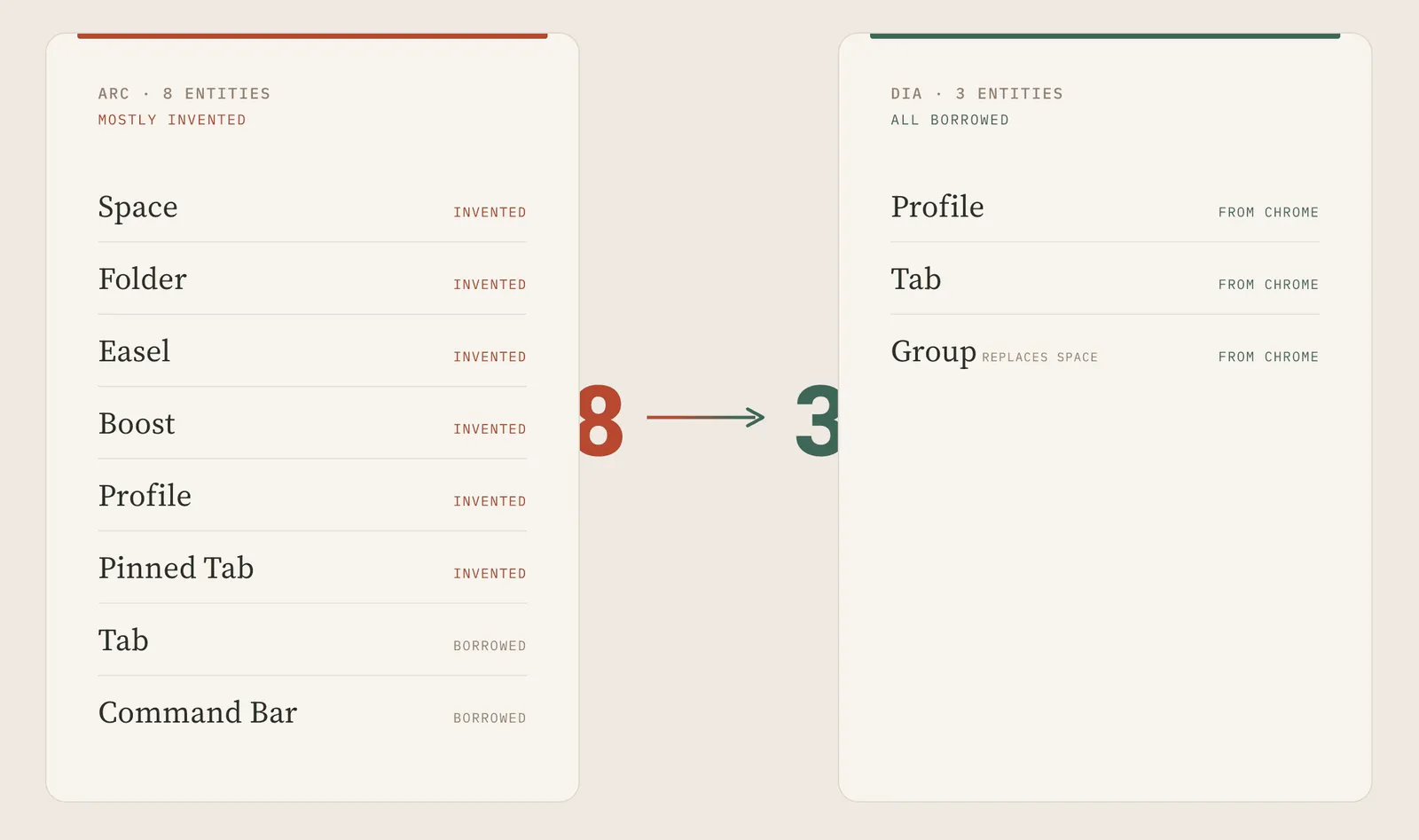
Arc asked users to hold eight core concepts: Profile, Space, Folder, Easel, Boost, Tab, Command Bar, and Pinned tabs. From a designer's chair these are tidy. The definitions are crisp, the relationships are coherent, the structure is genuinely elegant.
From a mass user's chair it is overload. Chrome runs on two concepts: Tab and Bookmark. Arc runs on eight, and six of them are invented from scratch with no real-world analogue. A Space is not a thing anyone has held before (unlike similar iOS features, this has never existed on a browser for general internet users). Neither is an Easel inside a browser.
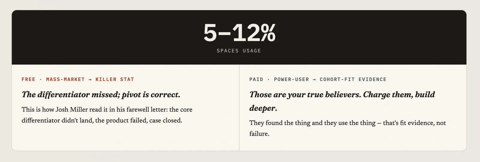
I call this the Entity Clarity Paradox. Concept clarity and mental share are not the same property. A beautifully defined entity that nobody adopts is just overhead with good documentation. The numbers say it plainly. Spaces, Arc's flagship idea, ran 5 to 12 per cent usage. Calendar preview ran 0.4 per cent. The differentiators never reached most users' mental models at all.

My working rule from this: every additional entity you add drops mass adoption by roughly one tier. Not because the concept is weak, but because mental bandwidth has a ceiling. A new user walks in with something like 7 to 9 entity slots free (we know 7 is a magic number for some reason). Arc sat right at the limit, then asked them to spend all of it before they had any reason to.
This is where the teardown earns its keep, because the successor confirms the reading. Dia, built by the same team with full knowledge of what failed, cut from eight entities to three. And the three it kept are isomorphic with Chrome's mental model. They did not just simplify. They retreated to concepts users already owned.
If you have a multi-primitive product, Notion and Coda and Airtable included, this is the ceiling worth respecting. Clarity per entity is necessary. It is not sufficient. Count the entities a first-time user must hold before they get value, and treat that count as a hard budget.
Lens 3: Strong acquisition, a funnel leaking in the middle
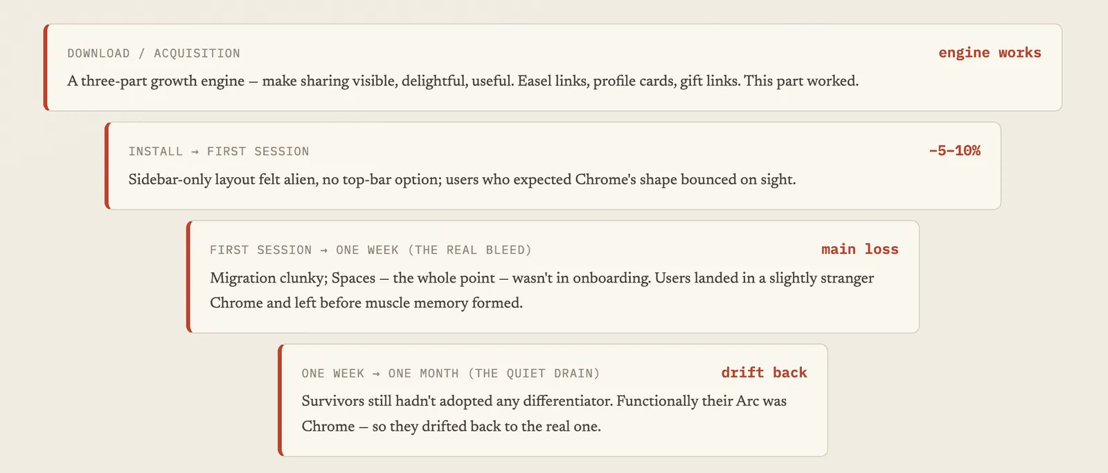
Arc built genuinely impressive share mechanics. You could make an Easel whiteboard and share a public link. You could generate a personal profile card and post it to social. You could gift Arc to a friend with a custom link. In my first walkthrough I described this as a three-part growth engine: make sharing visible, make it delightful, make it useful. That part worked.
The trouble started after the download. Strong acquisition met a retention funnel that leaked precisely in the middle, and "retention is bad" tells you nothing about where to cut. So I split it into three stages, each with its own failure mode.
Install to first session lost maybe 5 to 10 per cent on its own. The sidebar-only layout felt alien, there was no top-bar option, and users who expected Chrome's shape bounced on sight. Worth being concrete about the cost: on a 13-inch MacBook the sidebar eats around 200 pixels, roughly 15.6 per cent of horizontal space, and it cannot be changed to a top view. Arc's own users said it took about two weeks to feel natural. A 14-day adaptation window with a permanent space tax is the first door in the funnel, and it shuts early.
First session to one week was the real bleed. Chrome migration was clunky. Spaces, the whole point of Arc, was not part of onboarding. Users landed inside what felt like a slightly stranger Chrome, found no compelling reason to stay, and left before any muscle memory formed.
One week to one month was the quiet drain. The survivors still had not adopted Spaces, Easel, or any differentiator. Functionally their Arc was Chrome. So they drifted back to the real one (that was my experience).
The shape matters more than the total. "Users come in, never meet the differentiator, and drift back to the default" is a sentence you can act on. It tells you the fix is not more acquisition. It is moving the differentiator (and the "aha moment") earlier, into the first session, before the window closes.
Lens 4: The one primitive that carried
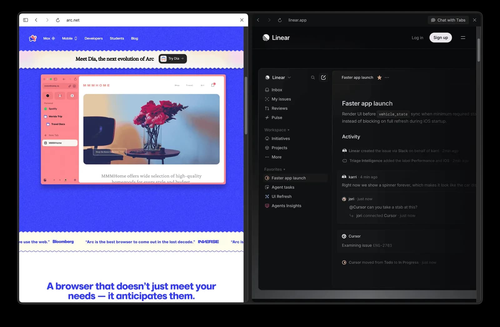
Among everything Arc built, one primitive survived intact into Dia. The Command Bar.
It is easy to file the Command Bar as a nicer address bar. It is more than that. In the LLM era it is a unified surface for capturing intent. You type a question instead of a URL. You start an AI action, a file operation, or a voice interaction from the same place. The system hands you scaffolding: history, autocomplete, context-aware suggestions. Intent plus scaffolding. That is the entry-point pattern Raycast, Linear, Notion, and Slack are all converging toward.
Here is the part founders should sit with. Arc the product died. This primitive did not. My rough split is that the Command Bar IP, plus a team trained to build this kind of interaction, accounts for 20 to 40 per cent of the $610M Atlassian paid. The rest of the primitives are supporting cast.
Brian Balfour framed the same acquisition from the strategy side, and it fits. Atlassian did not buy a browser. It bought the right to sit the browser as a coordination layer above every SaaS app a knowledge worker juggles. The browser stops being a window onto documents and becomes the place where work is initiated. The Command Bar is the literal surface where that initiation happens. Seen that way, $610M for a product with no revenue is not a charity write-off. Against $128M raised it is a 4.77x return, and it is a position, not a product.
The lesson is uncomfortable and useful. A product can fail while one of its primitives is the most valuable thing in the building. If you are deciding what to protect, do not protect the product. Protect the primitive that carries the user's real job.
Lens 5: The Moving List
Tearing down Arc alone would have been interesting. Tearing it down next to Dia changed what kind of document this is.
Think of it as a house move. When a team kills v1 (Arc) and builds v2 (Dia), they pack some things and leave the rest on the kerb. What they carry into the new place is the truest inventory of what mattered. When the same team rebuilds from scratch, what they keep tells you more than any post-mortem blog or CEO farewell. They have every incentive to be honest with themselves. They only get one rebuild, and they are spending real money on it.
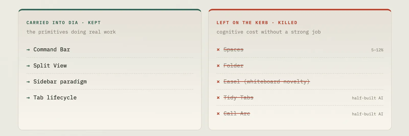
Dia kept the Command Bar, Split View, the sidebar paradigm, and the tab lifecycle. Dia killed Spaces at 5 to 12 per cent usage, Folder, Easel the whiteboard novelty, and the half-finished AI primitives like Tidy Tabs and Call Arc. Read that list as a verdict. The carried-over primitives are the ones that were doing real work all along. The discarded ones added cognitive cost without matching a job strong enough to justify it.
I call this the Moving List, and it generalises. It works for any "v1 failed, v2 reborn" story, any acquisition where the team rebuilds, any company pivot. The list of what got packed is the cleanest signal you will get about what was actually working, free of the narrative everyone tells after the fact.
For client work I turn it into one question, because the question forces a trade-off the polite version never does. If you started fresh today, which 50 per cent of your features would you keep? "What isn't working" invites a shrug and a defence. "Pick half and justify the cut" produces an honest map of where the value actually sits.
Lens 6: The number that reads both ways
One last thing worth sitting with, because it is the part most post-mortems get wrong.
Spaces ran 5 to 12 per cent usage. Josh Miller cited that number in his farewell letter as proof Arc had to start over. The core differentiator had not landed, so the product had failed. Case closed.
Except the same number reads in opposite directions depending on the business model you assume behind it.
In a free, mass-market model, 5 to 12 per cent is a killer stat. Your differentiator missed, your mass-market thesis is dead, and pivoting is correct. In a paid, knowledge-worker-only model, 5 to 12 per cent is cohort-fit evidence. Those are your true believers. They found the thing, they use the thing, and you should charge them for it and build deeper.
Same data. Opposite conclusion. The only variable that moved was the implicit business model.
So I will commit to the contrarian read, since a consultant who only agrees with the founder's letter is not worth hiring. Arc's deepest failure was not retention. It was running a revolution-grade product on a mass-market, free business model. The two were never compatible. Had Arc declared itself a paid tool for power users in 2023, charged eight dollars a month, and dropped the mass ambition, my estimate is downloads fall to a tenth, D30 retention roughly doubles, and the company reaches a real ARR instead of a soft landing. The product DNA was never the problem. The product and the go-to-market were pointed at two different people.
I owe you the counter-argument, because it is the honest part. Vivaldi has been the power-user browser for over a decade and still sits under 1 per cent share, so "just go niche" is not a free win. Zen, an open-source Arc clone, inherited Arc's refugees and copied Spaces wholesale, which suggests the concept was not the flaw. Put those together and the picture sharpens rather than blurs. Spaces was not a bad idea. It was a bad idea to charge nothing for it while inviting everyone.
What this means if you are the one shipping
Strip Arc away and you are left with six questions that do not care which product you run.
- Is your visual language inviting your actual customer, or someone adjacent who will never convert?
- How many entities must a first-time user hold before they reach value, and is that number inside their budget?
- Where exactly does your funnel leak, stage by stage, and is your differentiator on the right side of that leak?
- Which single primitive carries the real job, and are you protecting it or the wrapper around it?
- If you rebuilt from scratch tomorrow, which half would survive?
- The metric you are about to act on, does it read differently under a different business model than the one you assumed?
Arc is dead, and it still taught me two frameworks I now bring to live products: the fit audit, where visual language and entity count and mental model get checked against the real ICP (Ideal Customer Profile), and the Moving List, where what a successor packs up tells you which primitives were ever worth keeping.
If your product's problems feel cosmetic but might be structural, that gap is exactly where I work. The moving list, what a team packs when it leaves a product behind, is the most honest document a product ever produces. Most teams only get to read theirs after it is too late to act. The point of a teardown like this is to read yours while you still can.
Work with me
I run product teardowns for early-stage teams. The same six lenses you just read, pointed at your product instead of a dead one. If you suspect your own product has troubles that look cosmetic but run structural, that is the diagnosis I do.
You do not have to wait for your own moving list to write itself. Read it while you can still act on it.
Get in touch at hi@bearliu.com, and tell me what you are building.