Dia: The Budget Transfer
Dia is the same team's second draft of the same idea. It did not get smarter. It got more familiar. The reduction from eight invented concepts to three borrowed ones was not simplification. It was a budget transfer, and the budget moved to AI.
- Author
- Bear Liu, Fractional Product Designer
- For
- design leaders and founders deciding what to fix when a product is loved by a few and ignored by everyone else
- Method
- two recorded naked-eye walkthroughs, cross-referenced against Arc the predecessor, the founder's own farewell letter, public data, and competitor research
Why I tore down the sequel instead of the original
Most teardowns examine one product. This one only works because there are two.
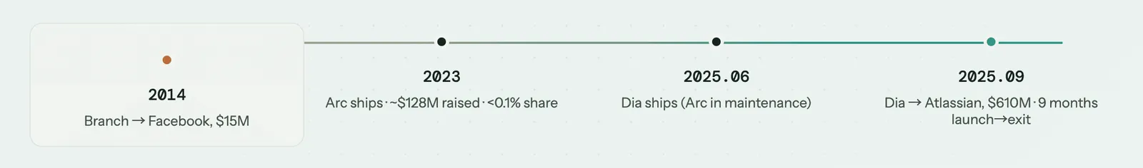
The Browser Company built Arc, raised roughly $128M, reached under 0.1 per cent global browser share, and put it into maintenance mode in May 2025. The same CEO and the same core team then built Dia, shipped it in June 2025, and were acquired by Atlassian for $610M that September. Three months from launch to exit. Two browsers, one set of hands, eleven years apart at the bookends.
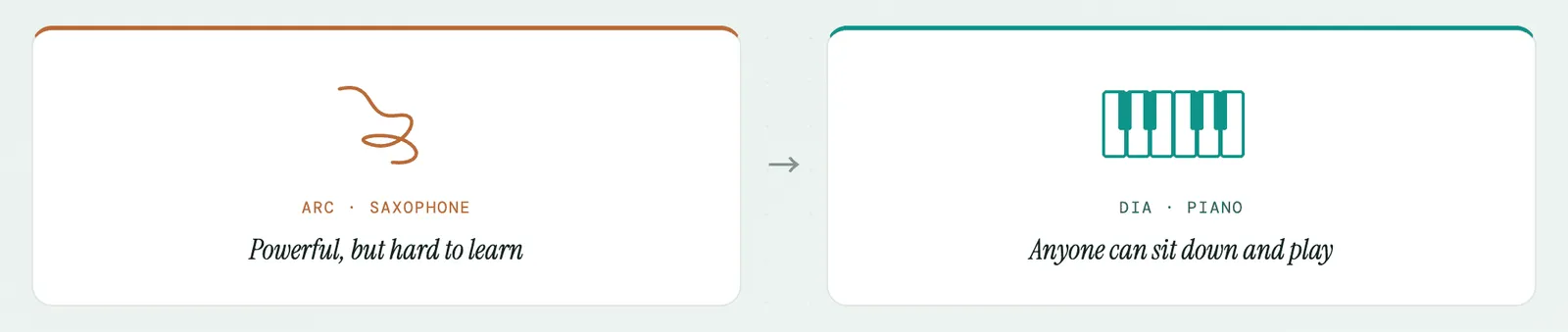
There is a detail in Josh Miller's farewell letter that frames everything. He quotes Scott Forstall, the former Apple SVP who shipped the iPhone, on what was wrong with Arc. "Arc felt like a saxophone. Powerful but hard to learn. Then he challenged us: make it a piano. Something anyone can sit down at and play." Arc was the saxophone. Dia is the team trying to build the piano.
That makes Dia rare. It is a public, funded, fully-shipped correction of a specific set of mistakes, made by the people who made the mistakes and now hold the data that proves it. When the same team rebuilds with the post-mortem in hand, you do not have to theorise about cause and effect. You can read the corrections directly off the second product.
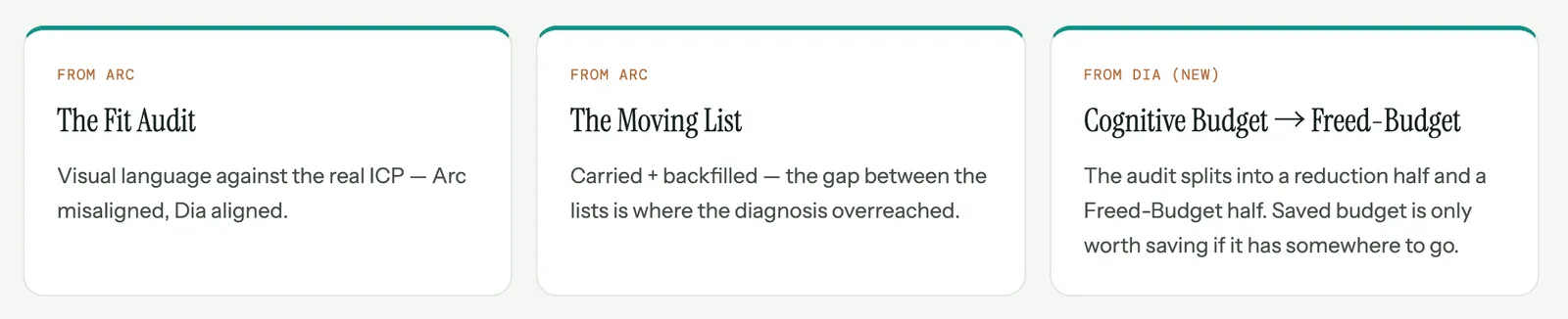
So this is the companion to my Arc teardown. Arc was the autopsy. Dia is the recovery. The Arc report surfaced two core frameworks, the Fit Audit and the Moving List. This report puts both through their second case and adds two more that only show up when you watch a team spend a freed budget. What follows is five lenses. Each one starts from something I saw inside Dia and turns into a question you can point at your own product.
Lens 1: The Fit Audit, run on the corrected case
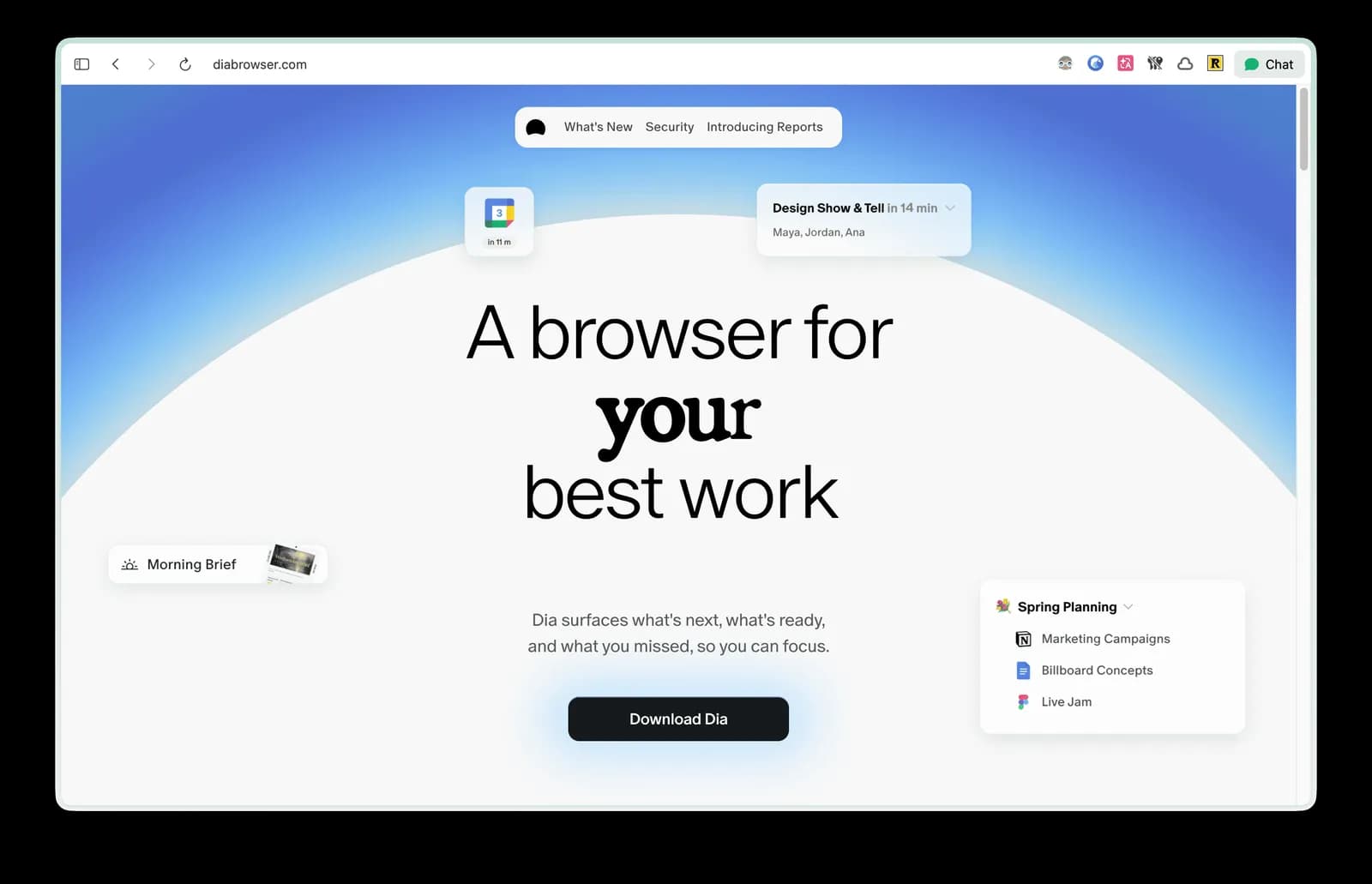
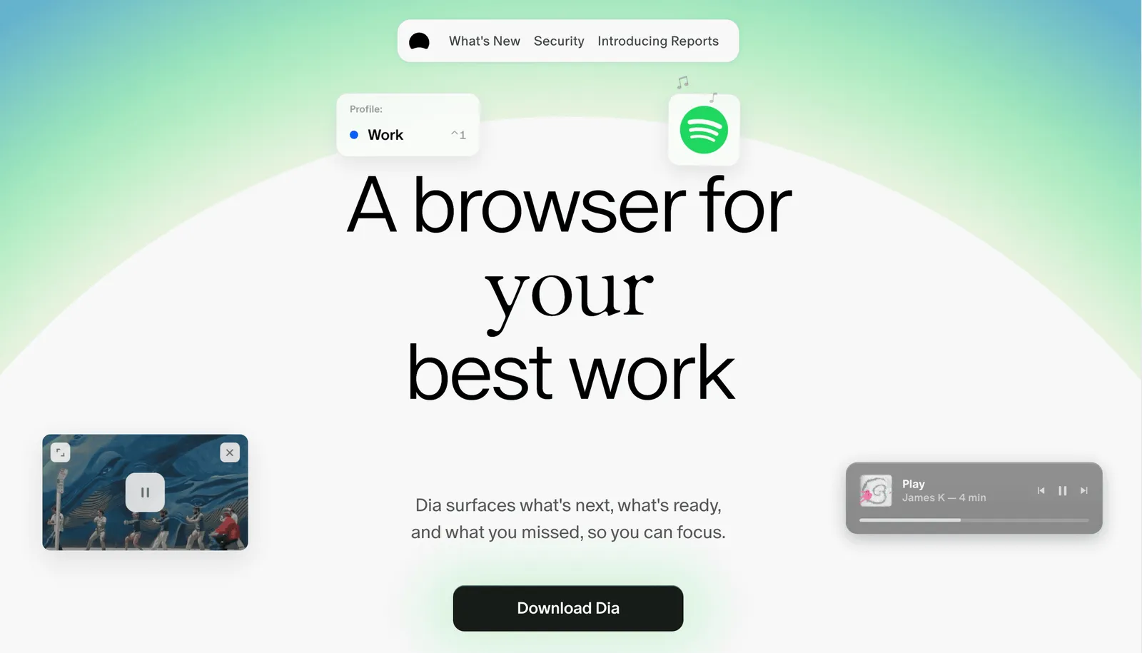
Open Dia's landing page and read the register before the words. Serif headlines. Clean layout. Demos showing a morning brief, meeting schedules, a Notion planning page, cross-tab reports. The whole surface says one thing in the first five seconds: this is built for modern knowledge workers.
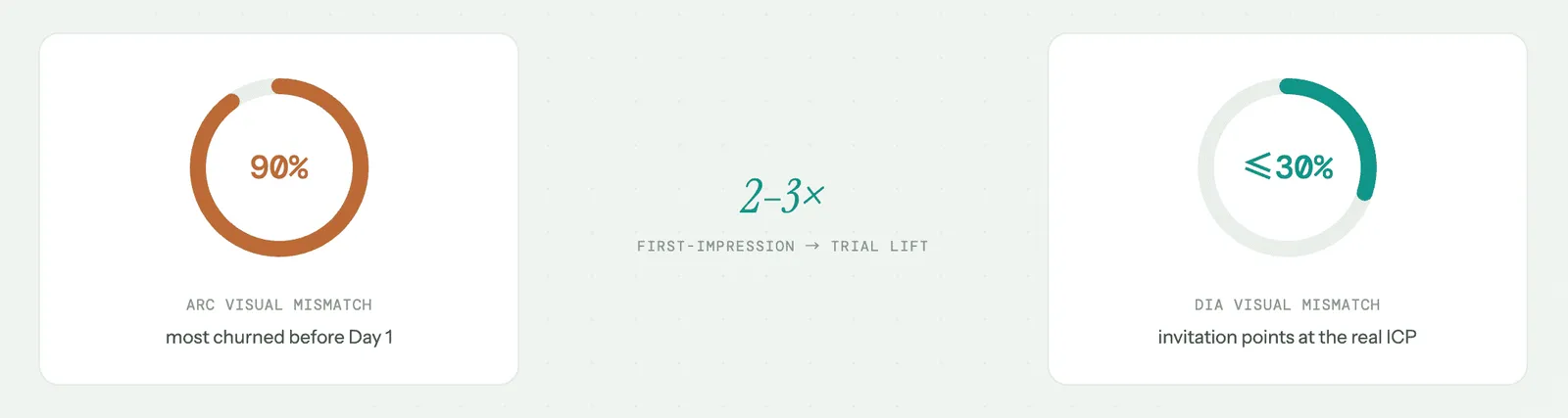
Now compare it to Arc. Arc's register was warm, artistic, vintage, soft animation, rounded corners. It sat in the visual family of Notion, Substack, and Linktree. It invited a consumer decorating a digital life. Arc's actual users were engineers, designers, and PMs. I put the mismatch at roughly 90 per cent. Most people who downloaded Arc met a visual signal in the first five seconds that whispered "this is for someone else", and that signal fired before a single feature was evaluated.
This is the Fit Audit. Your visual language is an invitation addressed to a specific kind of person. The only question that matters is whether that person is your actual customer. Arc was the misaligned case. Dia is the aligned one. The visual register now points at knowledge workers, and knowledge workers are the actual ICP. My rough estimate is that the mismatch dropped from around 90 per cent to 30 per cent or below.
The business impact sits at the very top of the funnel, which is why it compounds. Visual alignment governs first-impression-to-trial conversion, the step before anyone has read a word of copy or tried a feature. Arc's 90 per cent mismatch meant most downloads churned before Day 1 closed, not because the product was weak, but because the invitation was addressed to the wrong person. Dia's visual pivot alone likely lifted first-impression-to-trial conversion by two to three times. When you are a free product fighting for attention, a multiplier that early cascades through everything downstream.
There is one honesty problem worth naming, because the audit should catch it. Dia's hero is not perfectly clean. It carries consumer signals too, YouTube and Spotify playlists, sitting next to the Notion and meeting tiles. Atlassian's stated positioning is narrow: "the browser optimised for the SaaS apps where knowledge workers spend their day." A Spotify playlist does not belong in that sentence. So Dia is mostly aligned, with a residual hedge. The Fit Audit does not give it a clean pass. It gives it a far better grade than Arc and a note in the margin.
The question I carry from this: your visual language is inviting a specific person right now, on autopilot, whether you designed it to or not. Is that person your actual customer? If not, you change the visual or you change the customer. You do not get to ignore the gap, because your customer already read it.
Lens 2: The Cognitive Budget Audit, where the real correction lives
Arc asked a new user to hold eight core entities: Profile, Space, Folder, Easel, Boost, Tab, Command Bar, and Pinned. Tab and Pinned carried over from Chrome at near-zero cost. The other six were invented from scratch. A Space is not a thing anyone had held before, at least not coming from a browser. (Someone who already uses Spaces at the OS level may know the idea.) Neither is an Easel inside a browser.
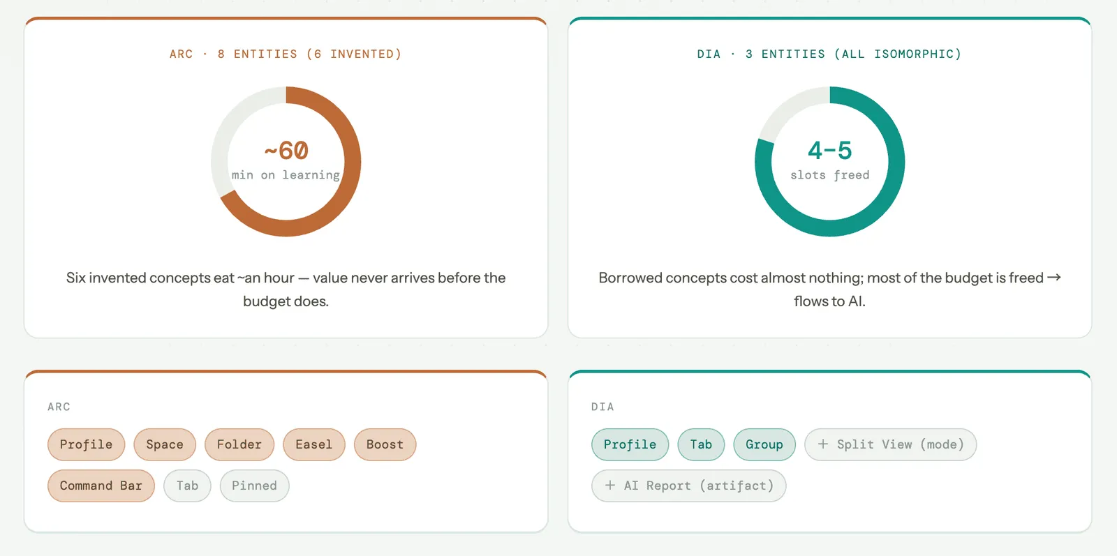
Here is the model I use. A new user walks in with a finite onboarding attention budget, roughly 90 minutes across the first week. Every invented concept costs around ten minutes to explain and try. Six invented entities spend roughly an hour. Arc burned that hour before the user reached the things that made Arc different. The budget was gone before the value showed up.
The data confirms the reading, and Miller published it himself. In the farewell letter he disclosed the numbers that diagnosed Arc. Only 5.52 per cent of daily users ever used multiple Spaces. Only 4.17 per cent used Live Folders. Only 0.4 per cent used Calendar Preview on hover. Miller called this the "novelty tax". My framing is more upstream. Spaces was not badly designed. The budget that should have paid for learning Spaces had already been spent on Profile, Folder, Easel, and Boost.
Dia cut to three entities: Profile, Tab, Group. Plus Split View as a view mode and AI Report as a generated artifact. The reduction matters, but the substitution matters more, and it runs on two levers at once.
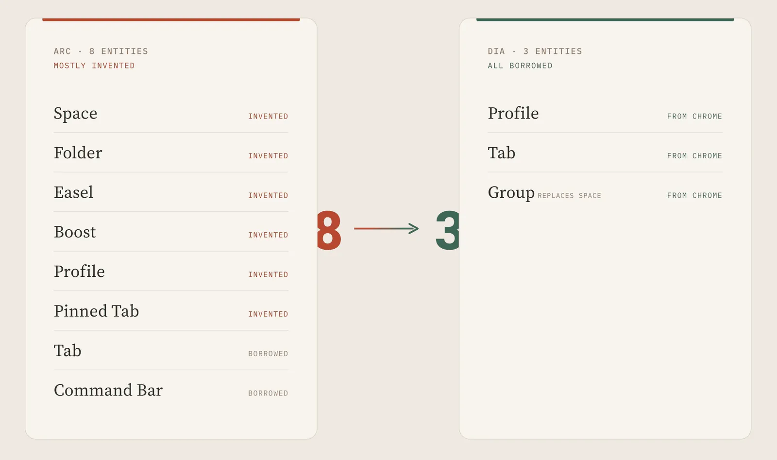
The first lever is quantity. Fewer entities, less total load. The second lever is type. Dia's Profile maps directly onto Chrome's account model, so it costs almost nothing to learn. Arc's Profile was a reinvented container that cost real budget. Same word, very different cost. Dia pulled both levers together. There is a third move underneath, easy to miss. Arc forced you to learn Folder upfront, because the sidebar put every entity in front of you on day one. Dia's Group appears only when you drag two tabs together, and AI names it for you. Learning moved from upfront to on-demand. Deferring a concept to the moment of need is cheaper than deleting it.
The instinct when you hear "too many concepts" is to cut features. Cutting carries the highest downstream cost, so it should be last. First, swap invented concepts for isomorphic ones. Second, defer upfront learning to on-demand. Do those two and the demand to cut the count usually disappears on its own.
That is the Cognitive Budget Audit. List every concept a first-time user must hold to reach value. Mark each as invented or isomorphic, upfront or on-demand. Add up the budget. If it exceeds the ceiling, the gap is your D7 retention loss. Arc sat at the ceiling with eight invented entities. Dia sits at three isomorphic ones, which left four to five budget slots free. That freed budget is the whole story, because of where it went next.
Lens 3: Where the freed budget went, the AI entry points
Most products bolt AI on as one chat sidebar. One surface, one mode, one friction level. Dia spread it across four core ones, each calibrated to a different friction-and-value profile. This is the answer to the question Lens 2 leaves open. Dia did not free four budget slots in order to feel lighter. It freed them so it could spend them on AI without overloading the user.
- The Command Bar carries the bulk of it, my estimate is 60 to 70 per cent of AI usage. It is the lowest-friction surface because it inherits the URL bar's muscle memory. You type a question instead of an address. No mode switch.
- The Side Chat covers maybe 15 to 25 per cent: medium friction, invoked on purpose, useful for sustained conversation about a page you are reading.
- The Multi-tab AI Report sits at 5 to 10 per cent: highest friction, highest value. You select three or four tabs and ask Dia to find the pattern across them, and it generates a structured report.
- The Proactive Alert runs at 0 to 5 per cent, system-initiated, low trust at this stage. The tab cleanup suggestion lives here. I watched Dia tell me 28 tabs had gone untouched. My instinct was to dismiss it, and I think most users dismiss it too.
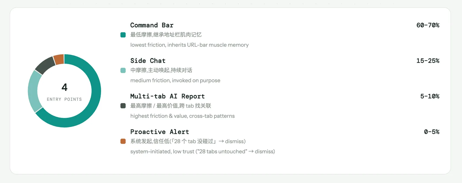
The design insight is the distribution itself. LLM-era tools need one dominant entry point plus a supporting cast. That is not a Dia quirk. Cursor, Linear and Dia all have multiple AI entry points. The pattern holds across the category: find the dominant surface, invest there first, let the rest play supporting roles. If you are building AI features, naming your dominant entry point and putting most of your AI infrastructure behind it is the single decision that returns the most. Spreading the budget evenly across four surfaces is how you ship four mediocre ones.
I want to coin the name here, because this is the genuinely new framework Dia surfaces and the Arc teardown did not have it. Call it the Freed-Budget Audit. It is the back half of the Cognitive Budget Audit, and it only applies to products that have already done the reduction. The audit is two questions. First, when you cut cognitive load, where did the saved budget go? Second, was it reallocated to your actual differentiator, or did it just evaporate into a cleaner-feeling product? Arc could not run this audit, because it never had a free budget to spend. Dia is the case that shows the saved budget has a destination, and the destination is the thing you actually want users to adopt.
There is a verification trap worth flagging on this lens. The relative weights I gave the four surfaces are estimates. If Dia's internal data shows a different dominant entry point, I am wrong, and that is the point. A claim about which surface dominates is falsifiable, which makes it more useful than "the AI is nice". Miller's own letter says chat-with-tabs hit 40 per cent of DAU and personalisation hit 37 per cent. Those are the only adoption numbers Dia has published, and they are high enough to suggest the freed budget did land on AI rather than evaporate.
Lens 4: The Moving List, run with Dia as the successor
In the Arc teardown the Moving List ran with Arc as the corpse and Dia as the mover. Same frame, viewed from inside the new house this time.
When a team kills v1 and builds v2 from scratch, they pack some primitives and leave the rest on the kerb. What they carry is the truest inventory of what was ever doing real work, free of the narrative everyone tells after the fact. They have every incentive to be honest, because they only get one rebuild and they are spending real money on it.
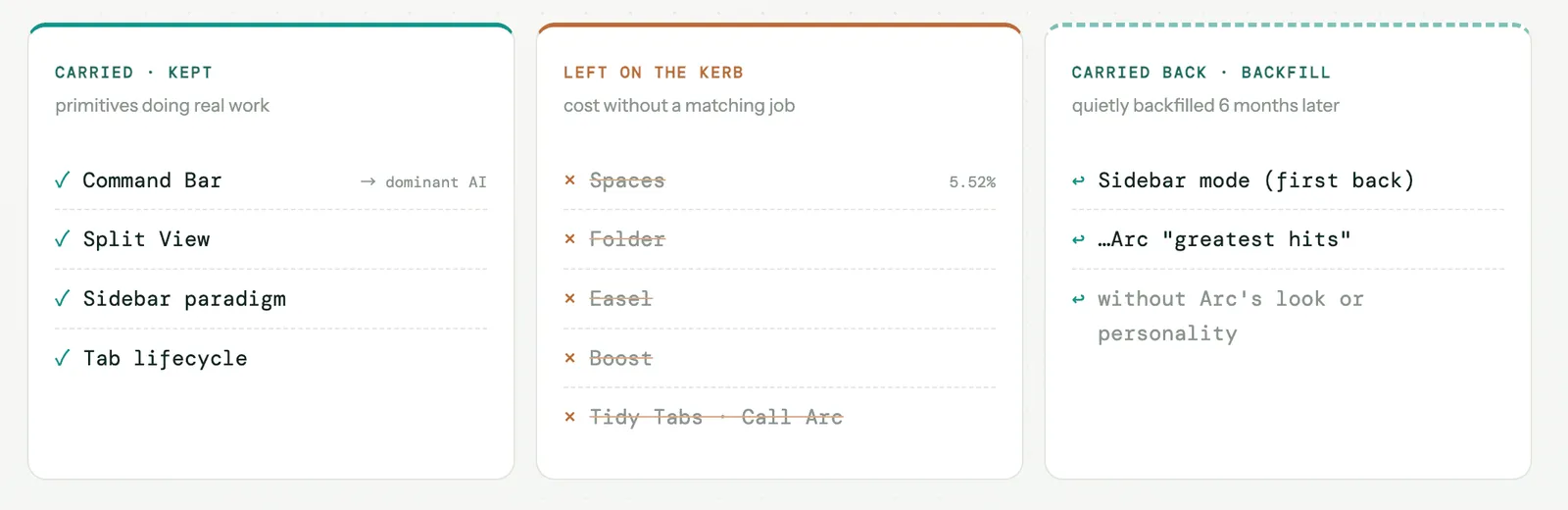
Dia carried the Command Bar, Split View, the sidebar paradigm, and the tab lifecycle. Dia left Spaces (5.52 per cent multi-Space usage), Folder, Easel, Boost, and the half-finished AI primitives like Tidy Tabs and Call Arc. Read the carried list as a verdict on what mattered. The Command Bar in particular was not a nicer address bar. It was the unified surface for capturing intent, the one primitive that justified a large share of the $610M, and Dia kept it and made it the dominant AI entry point. The keystone primitive survived two products.
For product design this becomes one question, because the question forces a trade-off the polite version never does. If you started fresh today, which 50 per cent of your features would you keep? "What isn't working" earns a shrug and a defence. "Pick half and justify the cut" produces an honest map of where the value actually sits. Dia is that map, drawn by the team that had the data.
One complication keeps the framework honest, and it is recent. Six months after launch, The Browser Company started backfilling Arc's "greatest hits" into Dia, the sidebar mode first. So the kerb was not final. Some of what got left behind is being carried back in, quietly, without Arc's visual language or personality. That said, this does not break the Moving List. It refines it. The first pass tells you what the team believed was core under pressure. The backfill tells you what users missed badly enough to force a reversal. Both lists are signal. The gap between them is where the team's first diagnosis was too aggressive.
Lens 5: The number that reads both ways, and the PMF that never finished
Everything above reads as a success story. Dia fixed the invitation, freed the budget, spread the AI, kept the keystone. The $610M acquisition validates the whole package.
Well, that is just one side of the story.
Start with the same number that closed the Arc teardown. Arc's differentiator usage read 5 to 12 per cent. Under a free, mass-market model, that is a killer stat and pivoting is correct. Under a paid, power-user-only model, the same number is cohort-fit evidence and you should charge those believers and build deeper. Same data, opposite conclusion, the only variable being the implicit business model. Dia chose to read it as failure and rebuilt for the mass market. That was a choice, not a fact, and it is worth holding in mind while we judge the result.
Now the structural problem Dia carries. It launched in June 2025 and was acquired in September 2025. Open-market PMF validation usually takes 18 to 36 months of independent operation. Dia never completed that cycle. Post-acquisition growth runs through Atlassian's captive distribution, not the open market. The current TAM is capped at Apple Silicon Mac users, roughly 15 to 25 million knowledge workers, until Windows, Intel Mac, and Linux ship.
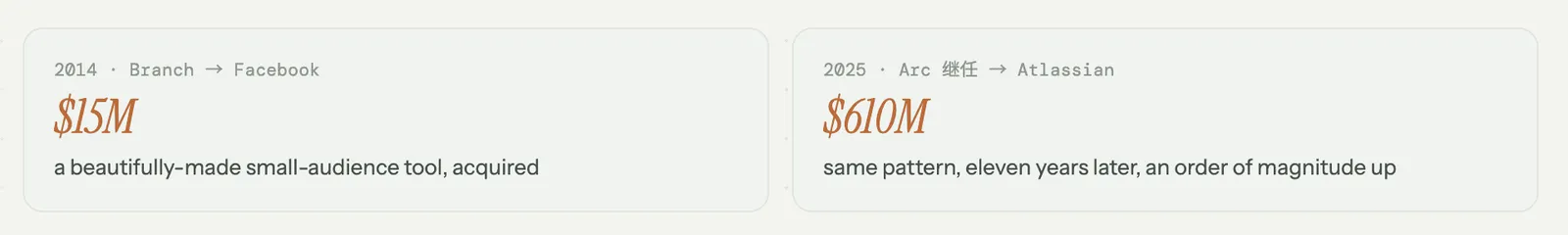
This is where the pattern matters. Miller sold Branch to Facebook for $15M in 2014. Eleven years later he sold Arc's successor to Atlassian for $610M. Both times the product was a beautifully made, small-audience tool acquired by a large platform before it reached mass scale on its own. So the uncomfortable read is available. Dia might be The Browser Company finding product-market fit. It might be Miller's second execution of a taste-over-scale exit. Continuity over revolution, entity reduction, four AI entry points, these might be genuine product mechanisms, or they might be highly polished demo material for Atlassian's board. The open-market data that would tell the two apart does not exist, because the acquisition happened before it could accumulate.
I think Dia got most of the product decisions right. I cannot prove it, and neither can anyone outside Atlassian. Naming that ambiguity is the most honest thing I can put in this report. The frameworks above hold regardless of which read is true. They describe what Dia did. Whether what Dia did was building or packaging is the one question the data has not yet answered.
What this means if you are the one shipping
Strip Dia away and you are left with a handful of questions that do not care which product you run.
- Is your visual language inviting your actual customer, or someone adjacent who will never convert?
- How many concepts must a first-time user hold before they reach value, and how many of those are invented rather than borrowed?
- When you cut that load, where did the freed budget go, and did it land on your real differentiator or just evaporate?
- If you rebuilt from scratch tomorrow, which half would survive, and which discarded half would users force you to carry back?
- The metric you are about to act on, does it read differently under a different business model than the one you assumed?
Arc taught me the Fit Audit and the Moving List. Dia confirmed both on a second case and taught me a third: the Cognitive Budget Audit splits into a reduction half and a Freed-Budget half, and the saved budget is only worth saving if it has somewhere to go.
If any of those questions landed without a clean answer, that gap is worth a closer look.
I write diagnoses like this one for other products. Where your design is quietly turning away the customer you want, what that costs you, and what to change first. If you would like one for yours, email me at hi@bearliu.com.