Linear: The Restraint Tax
Linear's moat is not speed. It is restraint used as a customer filter. Every subtraction quietly tells one kind of user "this is for you" and tells everyone else to go and buy Jira.
- Author
- Bear Liu, Fractional Product Designer
- For
- design leaders and founders deciding what to cut, who to serve, and how much their product should explain itself
- Method
- two recorded naked-eye walkthroughs of the core use stage, cross-referenced against public funding data, the founders' own writing, and a Jira / Notion / Asana comparison
Why I tore down the product everyone says is just fast
Most teardowns of Linear stop at the same word. Fast.
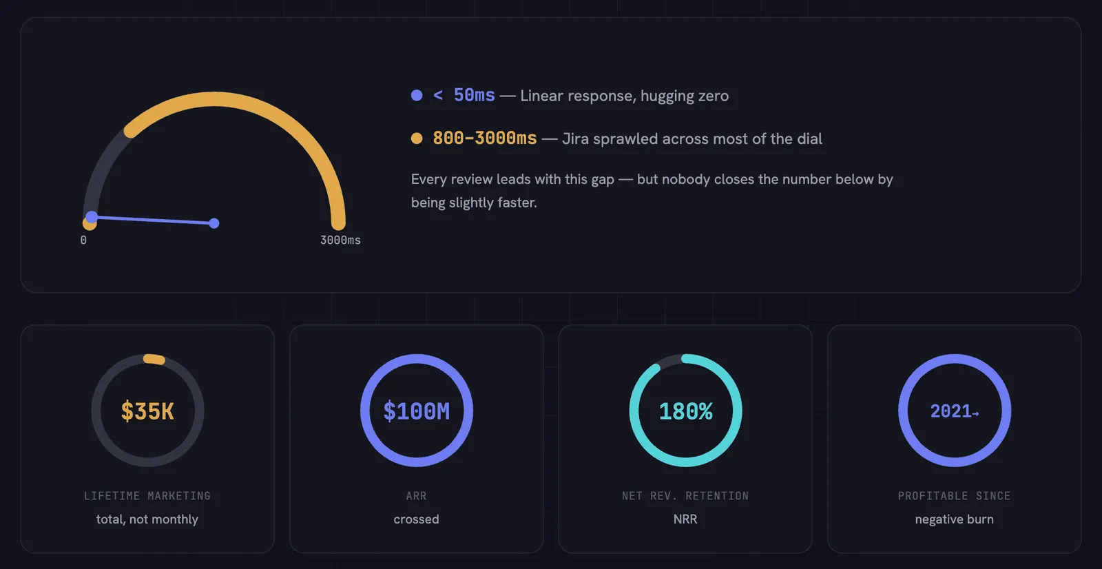
Linear responds in under 50 milliseconds. Jira sits somewhere between 800 and 3000. Every review leads with that gap, and Linear's own marketing leads with it too. Fair enough. Speed is real and it is felt in the hand.
But here is the number that made me pick Linear for a product teardown practice. Linear's lifetime marketing spend of roughly $35,000. Not per month. Total. For a company that crossed $100M ARR, runs net revenue retention around 180 per cent, and has been profitable since 2021 with what its CEO calls a negative lifetime burn rate. More cash in the bank than it ever raised. That combination is close to unheard of in high-growth SaaS, and you cannot explain it with just latency. A competitor can rebuild on a local-first architecture and close the speed gap inside one product cycle. Nobody closes a $35,000 marketing budget by being slightly faster.
So, if speed is the entrance ticket and not the moat, what is the moat? The answer that kept surfacing was restraint. Not minimalism as a visual taste. Restraint as a business strategy. Every time Linear chose to leave something out, fold a container, or hide a concept, it was performing customer selection through design.
One detail sets the tone. Linear's founder, Karri Saarinen, was lead designer at Airbnb before this. The product is run by someone who treats saying no as a craft, not a compromise. Most tools optimise for warmth and reach, for making everyone feel welcome on arrival. Linear optimised for what to refuse. This teardown is the story of what the refusing buys you.
What follows is six audit lenses. Each started as an observation about Linear. Each became a question I now carry into client work. If you ship a product, the value is not the verdict on Linear. It is whether these questions find anything when you point them at your own.
Lens 1: Your visual language is already choosing your customer
Open Linear and read the register before you read the words. Cold. Dense. Monochrome. Terminal-adjacent. No illustration, no soft gradient, no decorative warmth. The look sits in the same family as a code editor, not a notebook app.
Now look at who actually uses it. Engineers. Product managers who think like engineers. AI-native teams: OpenAI, Cursor, Perplexity, Scale AI. The visual register matches the tool register matches the real user. Zero misalignment.
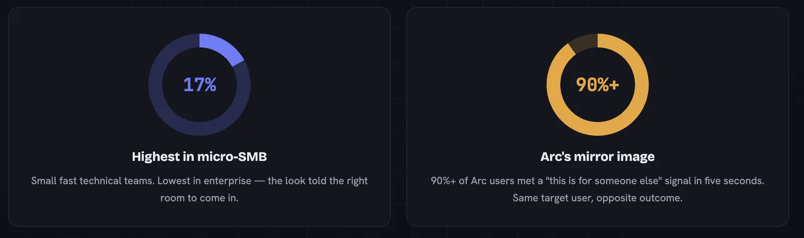
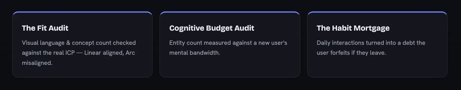
This is the Fit Audit, and Linear is the clean positive case. Visual language fires before a single feature is evaluated. In the first five seconds, before anyone reads a label, the look has already whispered either "this is for you" or "this is for someone else." Linear's look whispers it to exactly the person who converts. The market data backs the read. Linear's adoption is highest in micro-SMB at 17 per cent, the small fast technical teams, and lowest in enterprise. The visual told the right room to come in.
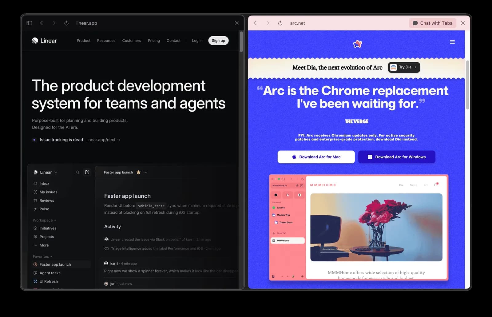
One contrast makes the point. Arc, a browser I tore down separately, shipped a warm, rounded landing page in the visual family of Notion and Substack, then watched engineers and PMs download it. The same real user as Linear's base, met in the first five seconds by a visual signal that said "this is for someone else." Linear dressed for the engineer it wanted and locked retention in before any feature was discovered. Same user, opposite signal, opposite outcome.
There is a founder-shaped reason, and it is the same reason flipped. A designer-founder like Saarinen treats restraint as a feature and the visual as a declaration of intended customer. A feel-first founder treats warmth as the goal and lets the audience sort itself out later, badly. The look is not decoration sitting on top of strategy. The look is the strategy's first sentence.
The question I now ask first on any audit. Your visual language is inviting one specific kind of person. Is that person your actual customer? If not, you change the visual or you change the customer. You do not get to ignore the gap, because your customer already read it in five seconds and acted on it.
Lens 2: Max three per group, and what the ceiling is really for
Open Linear and count. The left sidebar defaults to three items per section. Under a Team you get Issues, Projects, Views. The top toolbar holds three elements. Anything past three folds behind a "More" link.
In my first walkthrough I said out loud, "I don't think this is a coincidence." After two rounds I am sure it is not. When every UI container enforces the same density ceiling, cognitive load at any point in the interface becomes predictable. A new user never hits a wall of options. A returning user never has to re-orient.
This is the Cognitive Budget Audit applied at the container level. A first-time user walks in with a fixed amount of mental bandwidth. Linear treats that as a hard budget and spends it carefully, three slots at a time. The point is not that three is magic. The point is that the ceiling is enforced everywhere, so the budget never blows.
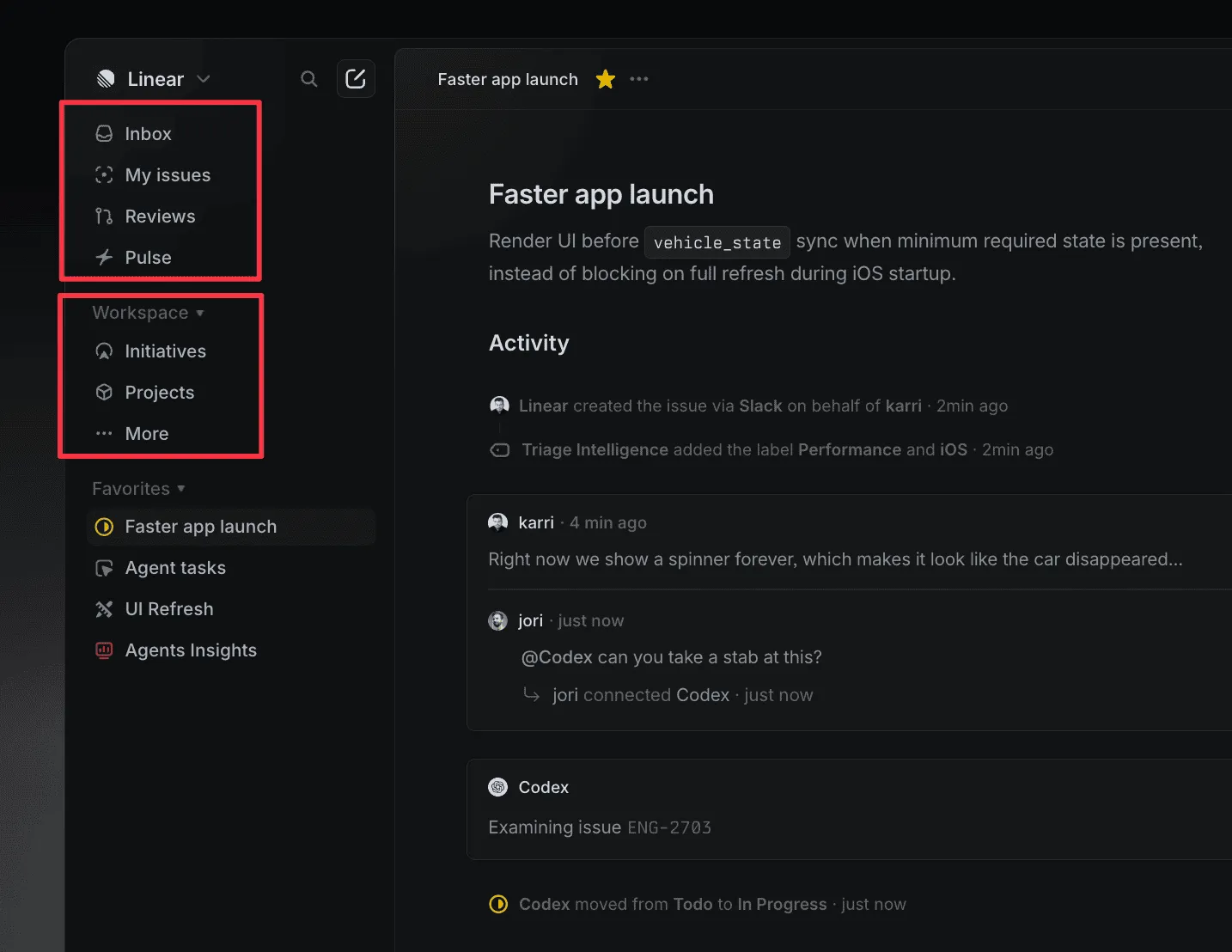
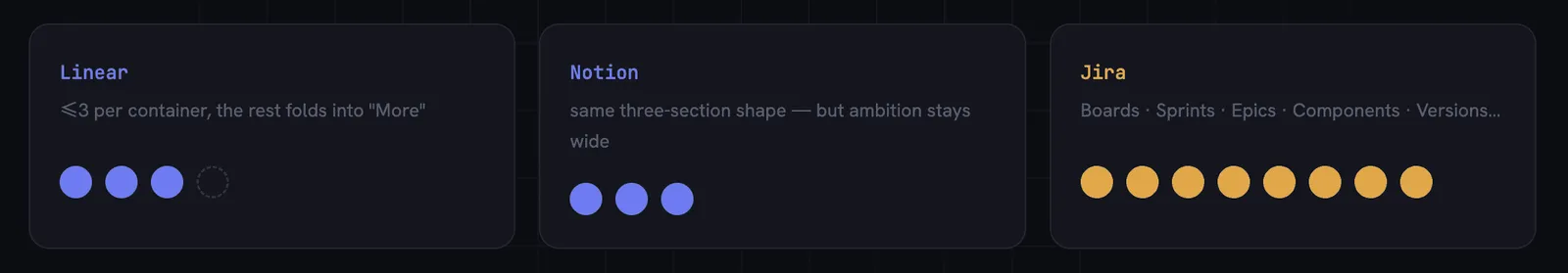
The trade-off is real and Linear pays it on purpose. This constraint caps feature expansion. Linear cannot stack capabilities into the sidebar the way Jira layers Boards, Sprints, Epics, Components, and Versions. So an enterprise buyer who needs visible feature completeness will look at Linear and feel "there is not enough here," then choose Jira. That is not a bug in the design. That is the design doing its filtering job. If you need everything visible at once, the product is telling you to leave. It is content to lose you.
Here is where Linear sharpens the read rather than just confirming it. Notion uses the same three-section sidebar shape. Notion is one of the largest tools in the category. So the "three per group" rule cannot be the differentiator on its own. What differs is what each product is willing to refuse. Notion keeps the density low but keeps the ambition wide, many use cases, one tool. Linear keeps the density low and the ambition narrow. The constraint only becomes a moat when it is paired with a refusal to serve everyone. Density without that refusal is just tidy. Density with it is selection.
For client work, "what density ceiling are you enforcing, and which users does that ceiling include or exclude" is now a standard line in my IA audits. The number matters less than the honesty about who it pushes away.
Lens 3: Keyboard shortcuts are a retention moat, not a power-user nicety
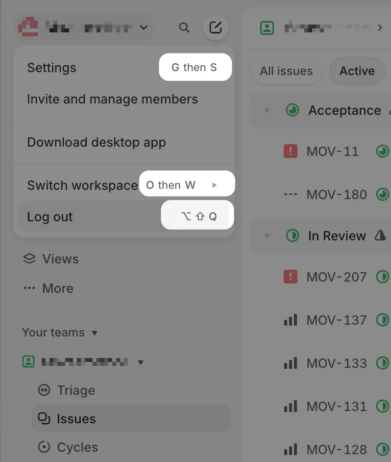
Almost every interactive element in Linear shows a keyboard shortcut in its hover tooltip. Status change, priority toggle, collapse, expand, create issue. The shortcut is right there, every time, appended to a tooltip that already exists.
In my first walkthrough I called this a "really smart way to manage information" and moved on. The mechanism is worth stopping on, because it is the cheapest training system I have seen in a B2B tool. No tutorial modal. No extra UI. Just a text string on a tooltip you were already going to read. After two to three weeks of daily use, an engineer stops reaching for the mouse on core operations. The tool disappears into the workflow.
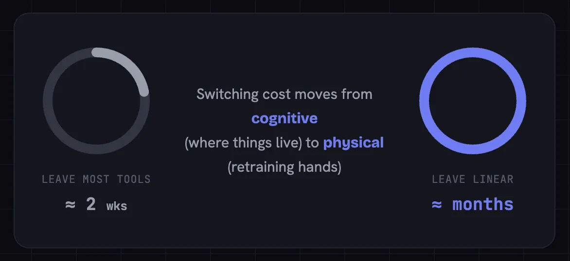
The retention consequence is the part founders should sit with. When a user leaves most tools, they leave a feature set they spent a couple of weeks learning. When a user leaves Linear, they leave months of muscle memory. The switching cost has moved from cognitive, remembering where things live, to physical, retraining hand patterns. That is a different and far stronger kind of lock-in, and it compounds silently every day the user keeps working.
This is the part the Fit Audit predicts. The mechanism only pays off because of who the user already is. Engineers live in keyboard-first environments already: terminal, vim, VS Code. Linear plugs straight into muscle memory infrastructure that someone else built and paid for. Notion and Asana could add the same shortcut density tomorrow. Their ICP (Ideal Customer Profile) is not pure engineering teams, so the return on that investment is lower and the habit never sets as hard. The same feature is a moat for Linear and a footnote for them. The feature did not change. The customer did.
I will name this one, because it generalises past Linear and it needs a shareable handle. Call it the Habit Mortgage. A product can quietly convert a feature into a debt the user owes their own hands. You do not pay it back by churning. You forfeit the months you already paid in. The audit question: which of your interactions is building muscle memory, and is that memory portable to a competitor or specific to you? Portable memory is a feature. Specific memory is a moat.
Lens 4: Desk versus document, a spatial metaphor worth stealing
Linear's interface splits into two layers. The left panel is the desk: stable, global, always visible, holding your team and project context. The right white card is a sheet of paper on the desk: local content that changes with every navigation. Open Ask Linear, and a second sheet slides on top of the first. The desk underneath stays put.
I said "desk and document" off the cuff during the first walkthrough and let it pass. That was a mistake, because the metaphor is the most valuable thing I produced that day. A metaphor surfacing is a signal that you have reached the interaction-paradigm layer, not the element layer.
The separation is clean: stable global state on the left, volatile local content on the right. An engineer switches between issues without losing track of which team or project they are in. Compare Asana and Jira, where most clicks replace the whole screen. In a workflow built on frequent issue-switching with constant project-level awareness, the desk-and-document model is measurably more efficient. The cost is that it suits a context-switching power user, not a role that runs many parallel projects with shallow depth in each. That is one more quiet nudge away from the cross-functional PM and towards the engineer.
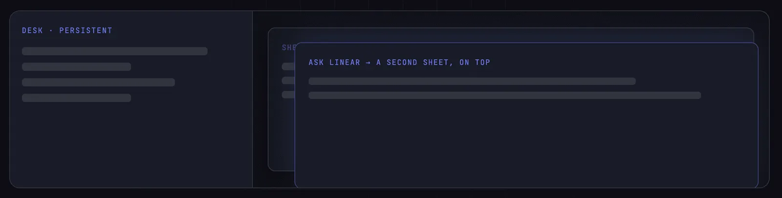
The metaphor also predicts how the AI layer must behave: Ask Linear (the AI feature) opens as a second sheet on the desk, not as a page replacement. Your global context stays visible underneath. If Linear had routed AI to a separate page, the context-switching cost would eat the very efficiency the desk model exists to create. The AI layer is constrained by the spatial grammar that came before it. New capability does not get to break old grammar.
For client work this became a diagnostic. Reviewing any tool with a left nav and a main content area, the first question is: does the left panel behave like a desk, persistent state, or like another page, volatile? The answer tells you whether the product is built for context-switching power users or for single-task work. And once you have a spatial metaphor, every new feature, AI included, has to earn its place inside it.
Lens 5: Cycle's disappearing act, and the courage to hide your headline feature
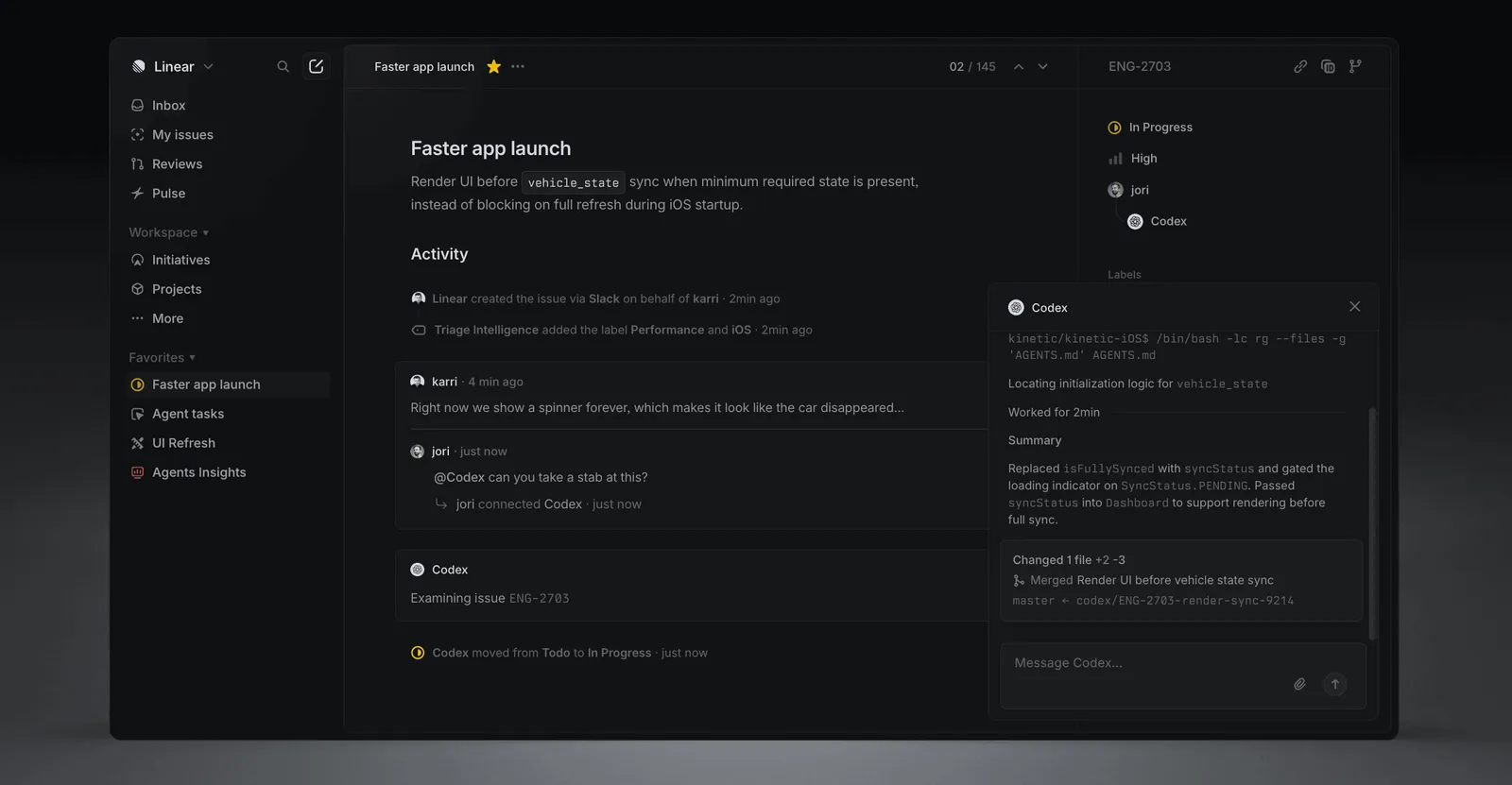
Research reports call Cycle the thing that makes Linear a sprint tool rather than a plain issue tracker. Its core differentiator. So I went looking for it with fresh eyes, and it was not there. I had to open settings and switch it on before it appeared in the sidebar at all.
That tension, "the research says core, the naked eye cannot find it," is the most dramatic thing this teardown surfaced. In my first pass I noted it and walked away. I should not have, because the gap between a product's stated headline and its default experience is usually where the real strategy hides.
Here is the strategy. The default ontology of Linear is Issue, Project, View, Team, Workspace. Five core concepts. Cycle is the sixth, and it stays off until a team turns it on. This is the Cognitive Budget Audit again, now at the ontology level. A new user gets five concepts to hold, not six, and none of them is the unfamiliar word "sprint." Only when a team signals it is ready for agile rhythm does the sixth concept arrive. Linear protects the new user from its own headline feature.
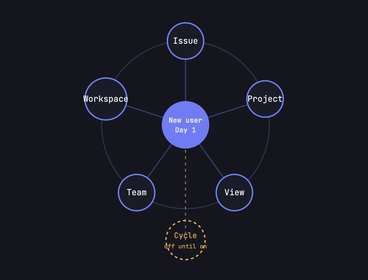
The cost is honest and Linear accepts it. Cycle's adoption is probably lower than its strategic importance warrants. Some teams never discover it. The benefit is a much lower activation barrier and a wider market. A non-agile team can adopt Linear without ever meeting sprint vocabulary, which pulls in users who would have bounced off a tool that led with sprints. The headline feature was demoted so the front door could stay narrow.
There is a hard founder lesson here, and it cuts against instinct. The feature your marketing is proudest of may be the one your onboarding should hide. Putting your most strategic concept on the surface feels like confidence. It can read as cognitive tax to a user who has not yet earned a reason to care. The audit question: which of your concepts are Day 1 necessities, and which should wait until the user signals readiness? Get that ordering wrong and you tax everyone to flatter the few who were ready on arrival.
Lens 6: Every feature Linear refused is a customer it refused
The strongest signal in any teardown is what is absent. Linear chose not to build multi-level issue nesting, only one sub-issue layer. No visual decoration, zero graphic elements in the default view. No deep mobile functionality, because keyboard shortcuts and hover tooltips do not survive a touchscreen. No feature stacking.
Read that as a list of customers turned away. Each absence has a face. The PM who wants rich hierarchy. The enterprise org that needs complex permissions and will outgrow Linear or never adopt it. The mobile-first user who will always get the weaker experience. The non-technical founder who opens Linear, feels "there is not enough here," and picks Jira or Asana. Linear looked at every one of those buyers and let them go.
That acceptance is the strategy stated plainly. The product does not try to serve everyone competently. It serves engineering teams exceptionally and lets the specificity do the filtering. And the filtering shows up directly in the cost structure, which is the part most designers never connect. When your design decisions screen out the users who would demand expensive support, heavy onboarding, and a constant stream of feature requests, your costs stay lean by construction. That is how you get to $35,000 of lifetime marketing and a negative burn rate. The restraint is not a tax the company pays. It is a tax the company collects, paid by every wrong-fit customer who self-selects out before they ever cost you anything.
The pricing follows the same logic. Linear picked the niche and charged for it from a position of strength, ten to sixteen dollars a user per month, with the free tier acting as a funnel rather than a destination. A low usage number on a feature like Cycle does not read as failure here. It reads as cohort fit, because the model was never built to serve everyone for free. The go-to-market is pointed at one person, the engineer, and the willingness to charge that one person from day one is what funds the profitability the rest of this report keeps pointing back to.
The audit question, and it is uncomfortable on purpose. Name the customer your product is refusing. If you cannot name them, you have not chosen, and a product that refuses no one usually serves no one exceptionally.
What this means if you are the one shipping
Strip Linear away and you are left with six questions that do not care which product you run.
- Is your visual language inviting your actual customer, or someone adjacent who will never convert?
- What density ceiling are you enforcing, and who does it include or exclude?
- Which of your interactions build muscle memory, and is that memory yours or portable to a rival?
- Does your left panel behave like a desk or like another page, and does your AI respect that grammar or break it?
- Which of your concepts are Day 1 necessities, and which should stay hidden until the user is ready?
- Can you name, out loud, the customer your product refuses to serve?
Linear is a success, and it taught me the same frameworks a failure does, only pointed the other way. The Fit Audit, where visual language and concept count get checked against the real ICP, with Linear as the aligned case. The Cognitive Budget Audit, where entity count is measured against a new user's mental bandwidth. And one Linear surfaces on its own: the Habit Mortgage, where a product turns daily interactions into a debt the user forfeits if they leave.
The thing Linear teaches a founder is not how to design. It is how to refuse. Speed got Linear in the door. Refusal is what kept the door narrow enough to be worth defending. If your product is trying to be enough for everyone and slowly becoming exceptional for no one, that gap is exactly where I work. The fastest way to find your moat is to write down, honestly, the customer you are willing to lose.
If any of those six questions landed without a clean answer, that gap is worth a closer look.
I write diagnoses like this one for other products. Where your design is quietly turning away the customer you want, what that costs you, and what to change first. If you would like one for yours, email me at hi@bearliu.com.