Raycast: The Interaction Model and Its Ceiling
Raycast built the cleanest keyboard interaction model on macOS. That same model structurally cannot hold AI. Glaze is the receipt the team wrote to itself.
- Author
- Bear Liu, Fractional Product Designer
- For
- design leaders and founders deciding whether a feature should bend into the existing product or break out into a new one
- Method
- two recorded naked-eye walkthroughs (about 70 and 65 minutes), cross-referenced against Arc, Dia, Linear, public data, and the founder's own statements
Why I tore down a launcher hiding in plain sight
Most products announce themselves. Raycast lives behind a single keyboard shortcut, and most of what it does you never see until you go looking.
Here is the number that made me look. Raycast opened its public beta in 2020 with 130 daily active users on day one. Today it runs at hundreds of thousands of daily actives, six years in, on about $47.8M raised across seed to a $30M Series B. A 30,000-person Slack community where the founders answer feedback themselves. Over 2,500 open-source extensions. And the whole thing rests on two keystrokes.
There is a founder quote that frames the harder half of this teardown. Thomas Paul Mann, the CEO, on AI: "If all you want is a way to talk to ChatGPT, you're practically spoiled for choice. But that's not the whole story of how we'll interact with large language models. It better not be." He is right that it should not be. The question this teardown sits with is whether Raycast's own interface can deliver the rest of the story, or whether the interaction model that made it great is the same one that caps what it can become.
In March 2026 Raycast shipped Glaze, a separate product that lets you build native desktop apps by chatting with AI. Most coverage read it as "Raycast does AI apps." I read it as a confession. A team does not start a new product line when the old one still has room. Glaze is Raycast telling you, in money and engineering time, where the command bar stops.

What follows is six audit lenses. Each began as something I watched happen on screen. Each became a question I now carry into client work. The value is not the verdict on Raycast. It is whether these questions find anything when you point them at your own product.
Lens 1: Two keystrokes that scale to 2,500 extensions
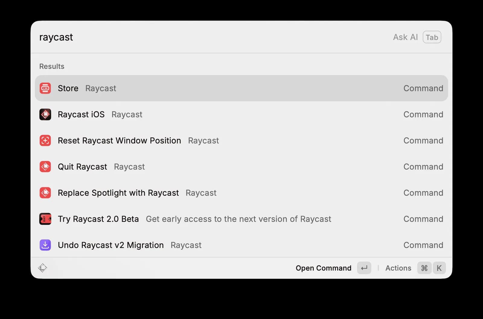
Open Raycast and type three letters: T-I-M. The list fills in. Time Machine, Screen Time, Date and Time. Press Enter to run the top item. Press Cmd+K to open a secondary list of actions: Open Application, Show in Finder, Copy Path, Add to Favourites, etc.
That is the whole interaction model. Enter does the primary action. Cmd+K opens the contextual action list. Every item, every command, every extension follows it. No exceptions and no special cases.
The consequence is the part worth sitting with. A user who learns the model on one command can operate any command. The activation cost is not "learn 2,500 extensions." It is "learn two actions, in roughly three uses, each under a minute." After that, every new extension costs zero to operate, because the model is already in muscle memory.

Put that next to Arc, which I tore down before this. Arc asked users to hold eight invented entities before they reached the differentiating features. Profile, Space, Folder, Easel, Boost, Tab, Command Bar, Pinned. This is what I called the Cognitive Budget Audit: count the entities a first-time user must carry before they get value, and treat that count as a hard ceiling. Arc spent the whole budget up front. Raycast spends two slots and isomorphic ones at that, because Enter and a modifier key are concepts every keyboard user already owns. The gap in onboarding attention is an order of magnitude, and it shows up in the numbers. Raycast has held power users for six years. Arc never crossed 0.1 per cent global market share.
So here is the new lens, the one Raycast surfaces that Arc did not. I call it the Interaction Model Audit. List a product's primary action, its secondary action, and its modifier layer. Check whether that model holds across every feature. Then go hunting for the feature where it breaks, where a user suddenly needs a new interaction pattern that the established rules do not cover. That break point is the product's architectural ceiling. It tells you where the product will eventually need to pivot, or where it will lose users to a competitor whose model fits the job better.
Raycast passes this audit with near-perfect marks for operating-system utility. The break point is AI.

Lens 2: Where the interaction model runs out of room
Raycast's command bar is built for flash interactions. Summon it, type, select, execute, and it dismisses. The mental model is summon, act, leave. The entire experience is tuned for tasks that take under ten seconds.
AI does not behave like that.
During the second walkthrough I typed "what's the time in New York now" into Quick AI. The answer came back, but I needed a follow-up. Quick AI does not do follow-ups. It is one-shot by design. To have a conversation I had to switch to AI Chat, a separate surface I reach by typing "AI" and pressing Enter, which opens a side panel with chat history and a model picker. Different entry point, different layout, different interaction logic.

So before every AI query the user makes a meta-decision: quick answer or conversation? That sounds trivial. It is not. The command bar's interaction model was a clean two-layer choice, Enter or Cmd+K. AI turns it into a three-way choice, Quick AI or AI Chat or no AI. Each time that meta-decision fires, it interrupts the zero-cost muscle memory the model was built on. Raycast's own design principles are fast, ergonomic, reliable. The command bar delivers all three for utility tasks. The moment AI enters, the ergonomic principle breaks, and it breaks because of the interaction model, not the AI model.
The mechanism is structural, not cosmetic. The command bar was built for summon, act, leave. AI needs persist, iterate, carry context. Those two patterns are incompatible. Quick AI and AI Chat are not two features serving two needs. They are two patches on an interaction model that ran out of room, and a user who feels mildly confused choosing between them is feeling the ceiling directly.
This is the part most reviews miss, because they grade the AI on answer quality. The problem is upstream of the answer. A flash surface cannot hold a task that wants to stay open. If you are adding AI to a product that was not designed around it, this is the lens. Find the interaction pattern your product was built for, then ask honestly whether AI fits inside it or forces a second surface bolted on the side. The second surface is the tell.


Lens 3: Glaze is the receipt
When an interaction model hits its ceiling, a team has two moves. Retrofit the old surface, or escape it.
Retrofit means bolting on what the model cannot hold. Dia bolts a chat panel onto the browser. Notion bolts a chat panel onto a docs tool. The original surface stays, the patch hangs off it. Escape means leaving the surface entirely and building somewhere new. That is Glaze. Local-first, OS-integrated, opinionated, and crucially not the command bar. Raycast chose to escape.
That choice is more honest than any user-research deck, because it costs real money. A product team that ships a separate product line is telling you the old product hit a structural limit. The new product is the receipt. I call this the Model Ceiling Pivot Signal, and it reads in two stages. A new interaction surface inside the product, like AI Chat, is evidence of a ceiling. A new product line outside the product, like Glaze, is confirmation.
Read against Raycast's strategy, the logic is clean. The command bar cannot be fixed for AI, so build around it and let users generate their own surfaces. If Glaze works, Raycast stops being "a launcher that controls the OS" and becomes "a platform that generates OS-native apps." That is a real expansion of the territory it owns.

Glaze is still a waitlist as I write this. The Verge covered the concept warmly, but the launch Reddit thread drew 177 votes, which is modest. There is no public adoption data, no proof the generated apps are good, no evidence the ecosystem will form. The strategic logic is sound. The product is a promise, not yet a result. So read Glaze as a signal about where Raycast believes its ceiling is, which is the useful part, and hold the question of whether the escape route actually leads anywhere as genuinely open.
The transferable move: when a team you are studying launches a new surface or a new product line, do not take the press-release framing. Ask what the old product could not do that forced the new one into existence. The answer is usually the most honest thing the company has ever told you about itself.
Lens 4: 450,000 installs is not a healthy ecosystem
Raycast's other defensive asset is its extension store. Over 2,500 extensions, all open-source, all built in TypeScript and React, all rendered through Raycast's own component library. The unified framework means every extension looks and behaves like the core product. That is a deliberate split from Chrome's Web Store, which allows arbitrary web tech and produces wildly uneven quality.
During the teardown I installed Color Picker. 450,000 installs. 613 contributors. Clean install, instant utility, consistent UI. Genuinely good.
But 450,000 installs on one extension is not evidence the ecosystem is healthy. It is evidence of extreme head-to-tail concentration. A public GitHub ranking of Raycast extension downloads shows the top 15 at 100,000 to 400,000-plus installs each, then a steep drop into a long tail of near-zero activity. Raycast's own extension guidelines acknowledge "abandoned" extensions and reserve the right to step in after three unanswered contact attempts. The headline number and the lived median are two different stories.

So I treat ecosystem health as three measurements, not one count. First, the head-to-tail distribution: if the top 20 extensions hold over 80 per cent of installs, the long tail is decoration, not value. Second, update recency: what share of extensions saw an update in the past six months? Third, developer entry rate: are new extensions appearing fast enough to offset abandonment? Raycast claims 2,500-plus extensions and 20,000-plus contributors, and the raw figures are real. My estimate is that 500 to 800 are actively maintained. That is a healthy core. It is not a healthy ecosystem, and the difference matters when someone is about to call this a moat.
The moat is real but narrow. It leans on a handful of prolific developers maintaining the top extensions, plus the unified framework keeping everything consistent. If even a few top maintainers stop shipping, the perception shifts fast, because perception was always carried by the head.
For any product with a third-party ecosystem, the audit question is not "how many extensions exist." It is "what does the median extension look like, and what happens the day three top contributors walk away." Count the median, not the headline.
Lens 5: One landing page, two customers, one of them hidden
Scroll Raycast's landing page and the visual language changes at roughly the 70 per cent mark. This is the Fit Audit applied to a platform, where the question is not whether the visual register matches one ICP, but whether the page is honest about which of its two audiences it actually prioritises.
The top section uses Inter, shader hero animations, product screenshots, and cases like Clipboard History, Emoji Picker, Calculator, Window Management. The menu-bar demo shows GitHub, Linear, a calendar event. This half talks to knowledge workers at tech companies. Sleek, fast, for people already living in modern SaaS.
Below the fold, around the "Build the Perfect Tools" section, the typeface shifts toward something closer to IBM Plex. The illustrations turn into engineering blueprints, with figure labels like "FIG-02", technical annotation, subtle grid animation. This half talks to developers, the people who will build extensions on top of Raycast.

Two registers, two segments, one page. Platform products do this routinely. Shopify separates merchant and developer messaging. Stripe separates business and developer docs. Figma separates designer and developer experiences. The execution here is precise, so this is not a critique of craft.
It is a critique of the split point. Raycast puts the developer section below the 70 per cent scroll line, which means roughly 70 per cent of visitors never reach it. Hold that next to Lens 4. If the extension ecosystem is the true moat, and developers are the moat's backbone, then the audience the company depends on for defensibility is the audience the page architecture serves last. Acquisition is pointed at knowledge workers. Defensibility rests on developers. The page optimises for the first and buries the second.
The lens generalises into the Fit Audit's platform variant. Find where the visual register switches. Map each register to its segment. Then ask whether the split point matches the segment's strategic weight. When the audience you most depend on sits below the fold, the page is quietly telling you who the company treats as primary, whatever the strategy slides claim.
Lens 6: The layer that pays the bills is the layer the thesis attacks
One last thing, because it is where the design read meets the business read, and most teardowns stop before they get there.
Raycast is free forever for the core. Launcher, window management, clipboard, emoji, snippets. The paid tiers are Pro at $8 a month, an Advanced AI add-on, and Teams at $12 per user a month billed annually. Third-party estimates put ARR around $5.2M, with Pro conversion somewhere near 10 to 15 per cent. Revenue is not disclosed, so treat those as estimates, not facts.
Here is the tension. The free tier already covers maybe 90 per cent of the daily utility. So what does a user pay $8 for? The honest answer is AI, plus Cloud Sync and themes. AI is the primary thing standing between the free tier and the paid one.

Now fold in Lens 2. My central read of Raycast is that the AI experience breaks the interaction model. If AI is the main reason to pay, and AI is the weakest-fitting part of the product, then the core driver of paid conversion is sitting on the shakiest ground in the whole design. That is not a small footnote. It is the business consequence of the interaction problem. The Reddit signal supports the read: a recurring user line is "I only use Raycast as a quick launcher and still open ChatGPT for the actual AI." If that habit is widespread, the paywall is leaning on a feature users route around.
This is the same shape I found in Arc, where one number read two ways depending on the business model behind it. Raycast's version: the AI friction is a minor usability nit if you assume the moat is the extension ecosystem, and it is an existential pricing problem if you assume the moat is AI. Same observation, opposite weight, and the variable that moves is which asset you believe carries the company.
I will commit to a read. Raycast's durable moat is not the command bar, which Spotlight plus Apple Intelligence can eventually copy, and not the AI, which any LLM wrapper can copy. It is the 2,500-plus open-source extensions and the 20,000-plus developers whose sunk effort lives in them, the way Homebrew's moat is its formulae and not its CLI. That asset is the hardest to replicate and, per Lens 4, the one whose health is least proven and least served by the page. The pricing rests on AI. The defensibility rests on developers. Those are two different bets, and Raycast is currently charging for the weaker one while depending on the stronger one it under-serves.

What this means if you are the one shipping
Strip Raycast away and six questions remain that do not care which product you run.
- What are your product's primary, secondary, and modifier actions, and is that interaction model consistent across every feature?
- Where does the model break, and is that break point the place your roadmap is quietly heading?
- When you add AI to a surface that was not designed for it, does it fit the existing pattern or force a second surface bolted alongside?
- When a team you admire ships a new surface or a new product line, what could the old one not do that forced it into being?
- In your third-party ecosystem, what does the median look like, not the headline?
- The feature your pricing leans on, is it the strongest part of the product or the weakest?
The deepest thing Raycast taught me is that a product's greatest strength and its hardest ceiling can be the same design decision. Two keystrokes made Raycast learnable in three uses and unbeatable at OS utility. Those same two keystrokes are why AI needed a second surface, and why Glaze needed to exist at all.

If any of those six questions landed without a clean answer, that gap is worth a closer look.
I write diagnoses like this one for other products. Where your design is quietly turning away the customer you want, what that costs you, and what to change first. If you would like one for yours, email me at hi@bearliu.com.